If you want to know about the theory of proportion or form and space in architecture or scale and proportion in architecture, please click the link.
Proportion refers to the relationship in size and scale between various elements in architecture. It is used to create balance and harmony in a design, and can be based on mathematical ratios, such as the golden ratio, or on historical precedents, such as classical orders.

Proportions are expressed as ratios or fractions, often using the golden ratio (approximately 1:1.6) as a standard for pleasing proportion.
The issue is the relationship between objects, or parts, of a whole.
Yes, that’s correct. Proportion in architecture refers to the relationship between the different parts or elements of a design, such as the relationship between the height and width of a building, the size of windows and doors, the height of a room, etc. The goal of proportion is to create balance and harmony in the design, and to make sure that the different parts of the design work together to create a cohesive whole.
1) About the proportion in architecture
The concept of proportion is required to bring about a sense of order in the various constituents of a composition.
The difference between ratio and proportion is that while the former is a quantitative relationship, the latter concerns itself with the relationship of aspects. In a rectangle of sides ‘a’ and ‘b’ the proportion is a:b, while ratio is 1:2, 1:3 etc.
- A proportioning system is based on a basic ratio that is continued in certain multiples.
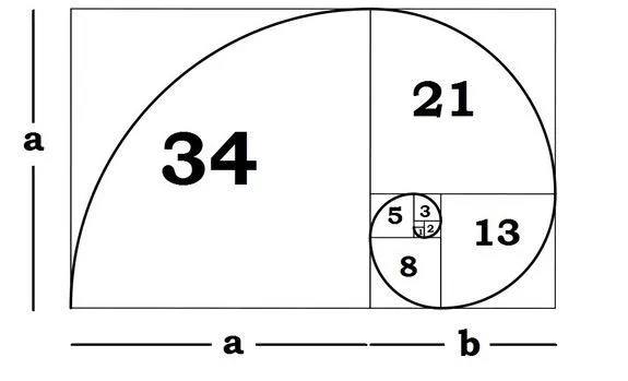
- Proportions are often appreciated in terms of the context or standard used to determine aesthetics – like beautiful eyes, beautiful face.

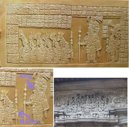
- When an artist deliberately changes the scale of the objects in his/her work to show which object is the most important, it is referred to as Hierarchical Proportion.
- Look as these bas-relief sculpture. Notice the size of the king compared to the size of others. (A bas-relief sculpture is a work that is sculpted in the front only. The images appear to be lifted from the surface, but they are not totally free and a true sculpture in the round).
Da Vinci’s Man is an example of the 1:1:6 ratio applied to the proportions of the human figure. Da Vinci illustrated various parts of the human body in the same proportion.
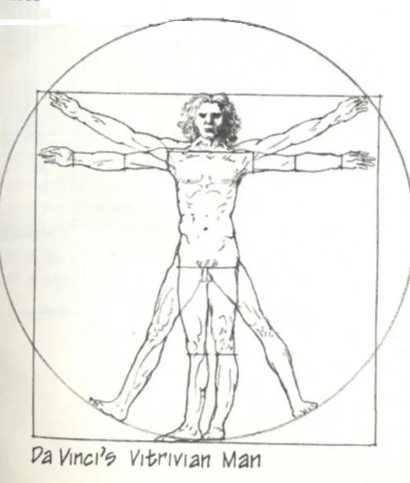
- Da Vinci’s Man provides the perfect example of his interest in proportion.
- Da Vinci demonstrated through Vitruvius Man structure of the human body in proportional ratios equal to phi as follow.
- The distance from the top of the floor divided by the distance from the navel to the floor.
- From the shoulder to fingertips divided by the distance from elbow to fingertips.
- From the hip to the floor divided by the knee to the floor.
- Divisions of finger joints, toes and spinal cards.
Note how the width and height have to be in a certain relationship for the body to look ‘proportionate’.

- Proportion is the relationship between components of a single object or composition, such as the ratio between height and width or the relative size of a part in relation to the whole.
- Components are in proportion to one another when they exhibit a visually balanced attitude; objects not in proportion do not appear to be compatible.
- Man has studied proportions for centuries, and mathematical ratios have been developed which have been derived from proportions existing in nature.
- These ratios, when applied to design, create a visually pleasing, balanced composition.
- For example, the ideal rectangle has been said to have a ratio of 3:5 along its sides. Many other laws of proportion have been developed and are of use to the designer in creating visually balanced, aesthetically pleasing designs.
- The best proportions are that appeal to the eye.
- A proportioning system is based on a basic ratio that is continued in certain multiples.
- The changing proportions of the depiction of beauty in human body changes with time place and culture.
- In all visual compositions, for these to be beautiful, each component of the composition must be “beautifully‟ proportioned by itself and must be in proportion to other components of the composition.
- While there are guidelines based on mathematical relationship like the golden ratio and Da-vinci man and Le Modulor, best proportions will come from a well cultivated eye.

Summary
Proportion in architecture can also be applied to the relationship between the entire building and its surroundings, as well as the relationship between the building and the human body. In many traditional architectural styles, the proportions of a building were believed to have symbolic or metaphysical significance.
The Golden Ratio, for example, is a mathematical formula that was often used in ancient Greek architecture to create aesthetically pleasing proportions.
Today, the principles of proportion continue to play an important role in the design of many buildings, with architects and designers using various techniques and tools to create pleasing relationships between the different parts of a building.
The use of proportion can help to create a sense of balance and stability in a building, as well as contribute to its overall aesthetic impact.
If you want to know about the theory of proportion, please click the link.
2) Golden Ratio
The Golden Ratio, also known as the Golden Section or Divine Proportion, is a mathematical formula used in architecture and design to achieve aesthetically pleasing proportions.
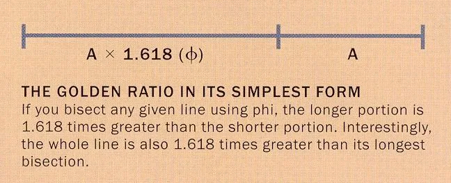

The formula is represented by the Greek letter phi (φ), and it is defined as the ratio of two quantities where the ratio of the smaller quantity to the larger quantity is equal to the ratio of the larger quantity to the sum of both quantities.
In architecture, the Golden Ratio has often been used as a principle for determining the proportions of buildings and their parts, such as columns, windows, and doorways. The idea is that by using the Golden Ratio in design, the result will be a harmonious and aesthetically pleasing composition.
However, it’s important to note that while the Golden Ratio is often discussed in the context of architecture and design, its use is not universally accepted by architects and designers, and its significance is sometimes debated.
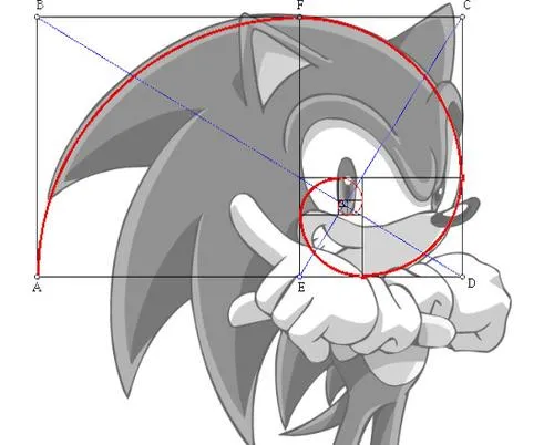
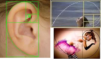
“Golden Rectangles” is a technique based on nesting inside each other a succession of rectangles based on the 1:1.618 proportions of the Golden Section.
- Numerous artists and architects have proportioned their works to approximate the golden ration. Directly associated with the golden section is a numerical system known as the divine proportion.
- Mathematically, the proportion is known as phi, which equals 1.1.618. This number is derived from the Fibonacci Numerical sequence (given below).

Example of the divine Proportion in buildings
Example of the divine Proportion can be found in architecture, art music, and symbols. The dimensions of the Pyramids of Egypt. The Greek Parthenon and few classical revival and contemporary buildings employ the divine proportion.
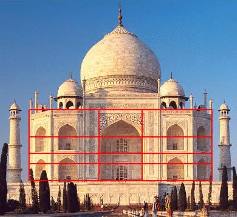

3) Rule of thirds
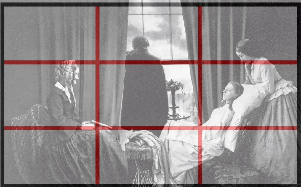
- A simplified version of the golden section is the ‘RULE OF THIRDS’.
- Oddly, it is not a rule at all. Rather, it is a ‚Rule of Thumb‛ associated with capturing photographic image.
- The golden section is believed to be the ideal proportional aesthetic.
- The proportional divisions of a rectangular format are divided into a grid of nine equal units approximately in similar proportions to the golden section.

- These drawing illustrated the similarities between the image are a of photographic and the golden section rectangle.
4) Fibonacci sequence
The Fibonacci sequence is the numerical series 1, 1, 2, 3, 5, 8, 13, 21, 34, 55, 89, 144 and is generated by the rule (f1 = f2 = 1, fn + fn-1 ). Fibonacci of Pisa introduced of the series in a problem involving the growth of a population of rabbits.
Each number is the sum of the two preceding numbers.
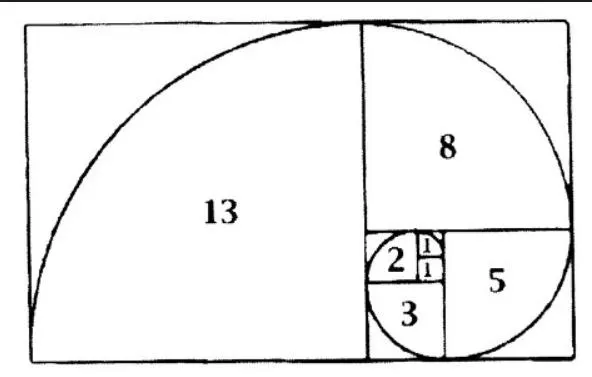
- The Fibonacci proportion series generating numbers 1,1,2,3,5,8,13. The succession of numbers is achieved by adding the last two number in the sequence.

Examples
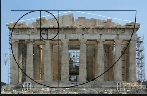

In conclusion, proportion is a fundamental principle of architecture and design that plays a crucial role in creating visually appealing, functional, and sustainable structures. Whether in historical or contemporary architecture, the principles of proportion continue to be a valuable tool for architects, designers, and builders.