If you want to know about the elements of design or objective of design or origin of architecture, please click the link.
The Principles of Design are concepts used to organize or arrange the component elements of design. The way in which these principles are applied affects the expressive content, or the message of the work.
- Generally, most of the principles of design are applied to any visual composition a designer creates. How a designer applies principles of visual design that determines how effective a design is in conveying the desired message and how attractive it appears. There is seldom only one correct way to apply each principle.
- The principles of design depict the manners in which a craftsman utilize various components of design in a structure.
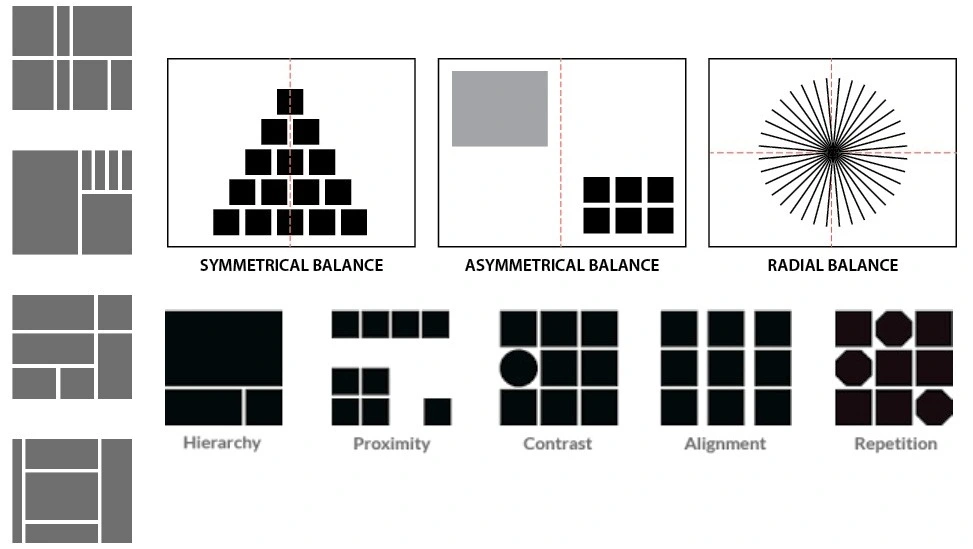
The principles of visual Design are generally stated to be:
- Balance
- Proportion
- Rhythm
- Emphasis
- Unity
- Contrast
- Harmony
Thinkers and design philosophers may use other terms to address these principles.
There is no particular order or priority of these in a composition and often, more than one may be applied in a visual composition.
There are many types of principles of design described below…..
1) Balance
- Balance is the concept of visual equilibrium, and relates to our physical sense of balance.
- It is are conciliation of opposing forces in a composition that results in visual stability.
- Balance in a three dimensional object is easy to understand; if balance isn’t achieved, the object tips over.
- To understand balance in a two dimensional composition, we must use our imaginations to carry this three dimensional analogy for ward to the flat surface.

- A feeling of balance.
- Equilibrium in design is like equilibrium in material science.
- A huge shape near the middle can be balanced by a little shape near the edge.
- Equilibrium gives strength and structure to a design

- When building up balance consider visual weight made by size, shading, surface and number of objects.

- Balance in visual computerization can be accomplished by changing the visual load of every component, regarding scale, shading, contrast, color and so forth.

- Balance in a Visual Composition is brought about with the balancing of “weights” of the segments of each element.
- Here the weights are visual weight that could be a consequence of selection of shape, color, texture, dimension or size i.e. the elements.
- Balance is thus an equilibrium of similar, opposing, or contrasting elements that together create a unified whole.
- The intention is to create a unified whole of different elements.

- Visual balance works more or less like a physical balance.
- Visual balance comes from arranging elements in the composition so that no one section is heavier than the other.
- Sometimes, an experienced designer may intentionally throw elements out of balance to create tension or a certain mood.

- Balance – is a feeling of visual equality in shape, form, value, color, etc.
- Balance can be symmetrical or evenly balanced or asymmetrical and un-evenly balanced.
- Objects, values, colors, textures, shapes, forms, etc., can be used in creating a balance in a composition.
- A large shape close to the center can be balanced by a small shape close to the edge.
- A large light toned shape will be balanced by as mall dark toned shape (the darker the shape the heavier it appears to be).

- Balance is the idea of visual balance and identifies with our actual feeling of balance. It is a compromise of contradicting powers in a structure that outcomes in visual soundness. Most successful compositions achieve balance in one of two ways: symmetrically or asymmetrically.

i) Symmetrical Balance
- Symmetrical balance can be described as having equal “weight” on equal sides of a centrally placed fulcrum.
- It may also be referred to as formal balance.
- When the elements are arranged equally on either side of a central axis, the result is Bilateral symmetry.
- This axis may be horizontal or vertical. It is also possible to build formal balance by arranging element sequally around a central point, resulting in radial symmetry.
Balance around a vertical axis
Balance around a horizontal and vertical
Balance on a diagonal axis
Balance on a radial axis
- Occurs when the visual weight of design elements evenly divided in terms of horizontal, vertical, or radial. This style relies on a balance of two similar elements from two different sides.

Biaxial symmetry
A symmetrical composition can have more than one axis of symmetry. Biaxial symmetry uses two axes of symmetry — vertical and horizontal.
- These guarantee balance: top and bottom as well as left and right.
- The top and bottom can be the same as the left and right, or they can be different.
- The most regular and repetitive image occurs when they are the same.
Approximate symmetry
There is a variant of symmetrical balance called approximate symmetry in which equivalent but not identical forms are arranged around the fulcrum line.
Inverted Symmetry – Balance
Inverted symmetry uses symmetry with one half inverted like a playing cards. This is an interesting variation on symmetry but can make for an awkward balance
Radial Balance
This axis might be level or vertical. It is additionally conceivable to build formal balance by arranging elements similarly around a central point , bringing about radial symmetry.
ii) Asymmetrical Balance
- Asymmetrical balance, also called informal balance, is more complex and difficult to envisage.
- Visual balance can be seen in the same light as physical balance that is a study of physics. See it in the following light:
- It involves placement of objects in a way that will allow objects of varying visual weight to balance one another around a fulcrum point. This can be best imagined by envisioning a literal balance scale that can represent the visual “weights” that can be imagined in a two dimensional composition.
- Forexample,itispossibletobalanceaheavyweightwithaclusteroflighterweightsonequalsidesofafulcrum;inapicture,thismightbeaclusterofsmallobjectsbalancedbyalargeobject.
- It is also possible to imagine objects of equal weight but different mass (such as a large mass of feathers versus a small mass of stones) on equal sides of a fulcrum.
- Unequal weights can even be balanced by shifting the fulcrum point on our imaginary scale.

- Happens when the visual load of plan components are not uniformly appropriated in the focal pivot of the page.
- This style depends on visual games, for example, scale, contrast, shading to accomplish a balance.
- We often see a design with the big picture offset by the small but visible text balanced because of the visual games.

iii) Example of Balance
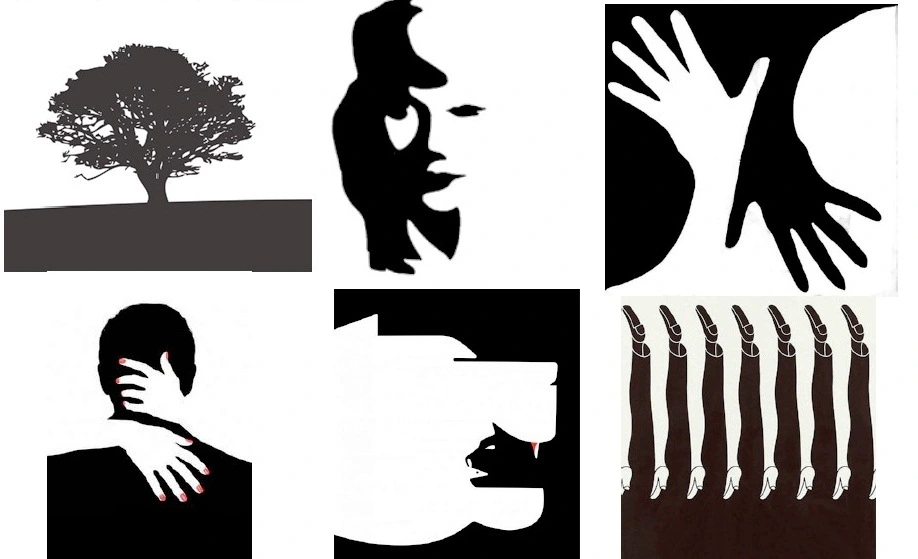
a) Balance by Value
- Happens when a little region with bright/high worth tones is combined with an enormous area with a dull/low worth tone.

- A man and a canine that has a high value (solid black) with a wide territory that has a lower value (grey.

b) Balance using Texture
- Little region with an intriguing texture looks offset when joined with an enormous flat area (no texture).

- Undulating water has a water texture which pulls in the focus, seems adjusted with a more extensive territory yet not textured.

c) Balance using Colours

d) Balance using Shapes
- Made through field of complex composition with a level field.
- Complex/more detailed field will show up in balance with the level area in the contrary side.
e) Balance using Space
2) Rhythm
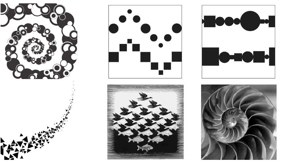
- Rhythm is a word taken from music and when there is a “beat” or “harmonic flow” the composition -musical or visual becomes rhythmic.
- Rhythm in a visual composition can be inserted by arranging the constituent objects so that there is a sense of movement.
- It is usually achieved by a systematic repetition of some objects. Alternation of different objects is also used for creating rhythm.
- Rhythm in architecture is the dull utilization of a gathering of visual components, at least multiple times, to set up a recognizable “pattern.”
- A visual rhythm or beat. The standard of design that alludes to a normal redundancy of components of art to create the look and feel of development. It is regularly accomplished through the cautious placement of rehashed segments which welcome the viewer’s eye to bounce quickly or coast smoothly from one to the following.
Simple Examples
- The alternating window and column arrangement of most high rise office buildings.
- More complex rhythms make use of what in jazz music is called “counterpoint”, that is, two or more intersecting or overlaid rhythms.
- This is seen frequently in classical architecture, where a series of columns and openings are overlaid on top of a series of smaller openings.

i) Type of Rhythm
- Repetition
- Gradation
- Radiation
- Opposition
- Transition
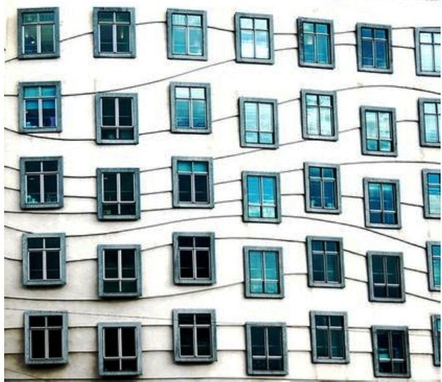
a) Repetition
- Rhythm made by duplicating (repeating) shapes, colors, pattern, line, surface.
- Rehashed Window panel, repeated Stripes on divider and design just as shade of glass.
b) Gradation
- Rhythm created by a gradual change in size or color.
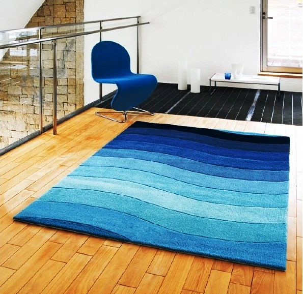
- Carpet on the floor changes gradually in value.

c) Radiation
- Rhythm created by identical objects coming from a central axis.

- The glass frames “radiate” from the center of the path.
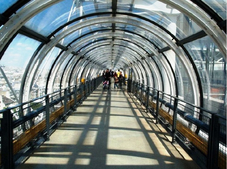
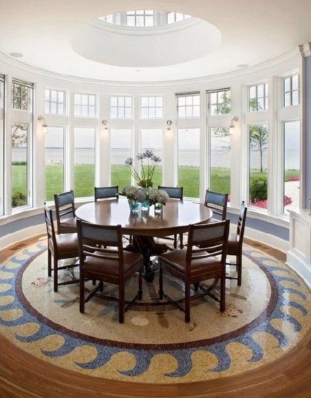
- The floor design, the windows, furniture etc. in redial rhythm.
d) Opposition
- Rhythm created direct placement of lines, shapes or colour to create opposition through abrupt visual change.
- Contrasting black and white tiles and the lines intersecting at right angles.


e) Transition
- Rhythm made by curved lines that convey your eye across a straight surface.
- Window medicines that gently loot down, make a soft rhythm by transition.

3) Emphasis
- When one area in a work of art stands out more than another. The part that catches your attention first.

- Emphasis makes a point of convergence in a plan piece; it is the way we bring attention to what exactly is significant in it.
- It is the focal point of consideration and interest inside an arrangement In Architecture the element orders consideration and makes a design outwardly fascinating.
- The fundamental explanation in utilizing emphasis is to assist you with conveying the message that should be imparted.
- Emphasis helps readers determine the significant data on your showcase and permits them to interpret the message quicker.
- This cycle of masterminding the visual elements on an arrangement as per their request for significance and emphasis is called Visual Hierarchy. Visual Hierarchy is utilized to manage readers attention to the primary puts on your synthesis.

How to Create Emphasis?

- Make it bolder
- Make it brighter
- Change Style
- Add special visual effects.
- Add a border or frame
- Add more negative of positive space
- Add shadow or lights
- Change the color
- Change the position
Guidelines for Creating Emphasis!
- The point of emphasis should command attention, but not dominate the overall design.
- Other features within the composition should not compete for the emphasis or contrast.

4) Contrast
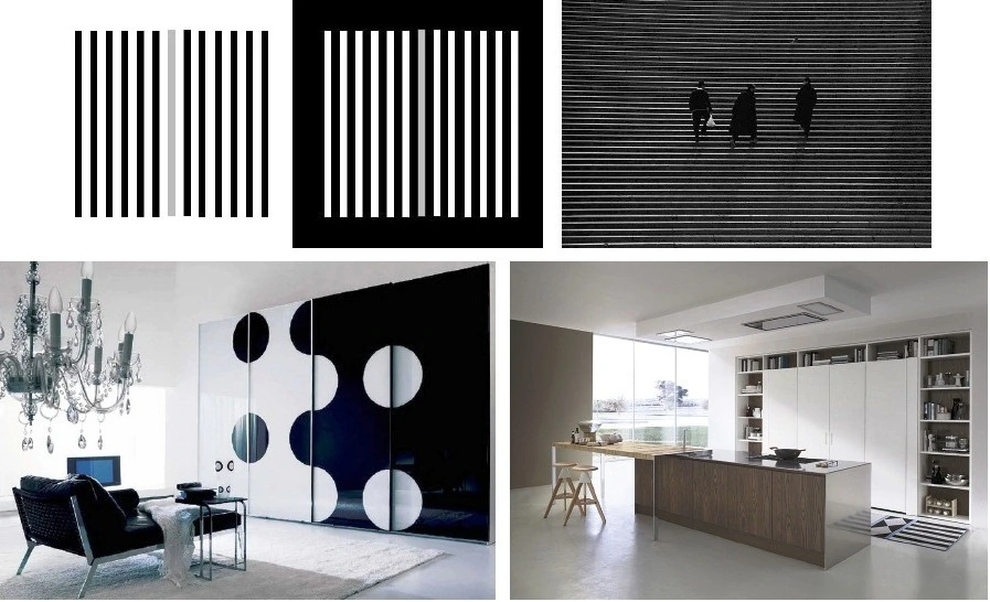
- Contrast means showing differences in two different sections of the design or showing somehow that the design being created is very different from other designs because of its contrast. Contrast can also be used to show emphasis in any part of the design.

- Contrast achieves emphasis by setting the point of emphasis apart from the rest of its background. Various kinds of contrasts are possible. The use of a neutral background isolates the point of emphasis.
- Contrast of color, texture, or shape will call attention to a specific point.
- Contrast of size or scale will also make the eye move to a particular point in a composition.

- Contrast offers some change in quality of components of a composition.
- Contrast can be generated by different shapes.
- It can be used to bring objects out and forward in a design.
- It can also be used to create an area of emphasis.
- Contrast is the juxtaposition of opposing elements e.g.. opposite colors on the color wheel -red / green, blue / orange etc. Contrast in tone or value -light / dark. Contrast in direction -horizontal / vertical.
- Too much contrast scattered throughout a composition can destroy unity and make a work difficult to look at.
- Contrast is just characterized as difference. Contrast between elements or subjects inside a masterpiece or composition. Contrast can be created through assortment inside the components of art. (i.e. value, color, texture) Contrast can be used to make a point of convergence or territory of interest in a fine art.
- Contrast is firmly related with variety which is typically considered as principle of design. Albeit some craftsmanship idealist, stick with assortment and contend that contrast simply makes assortment.
Examples
a) Contrast in Colour
- Complementary colours provide a high level of contrast.
- Complementary colours are colours that are located directly across from each other on the colour wheel.
- Red and green, blue and orange, and purple and yellow are all examples of this.
- But when using complementary colours, we also must consider value.
- Value is the darkness or lightness of colour.
- Without contrast in value, the contrast created by complementary colours is counterproductive.

b) Contrast in Texture

c) Contrast (variety) in Size & Shape

d) Contrast (variety) in Space
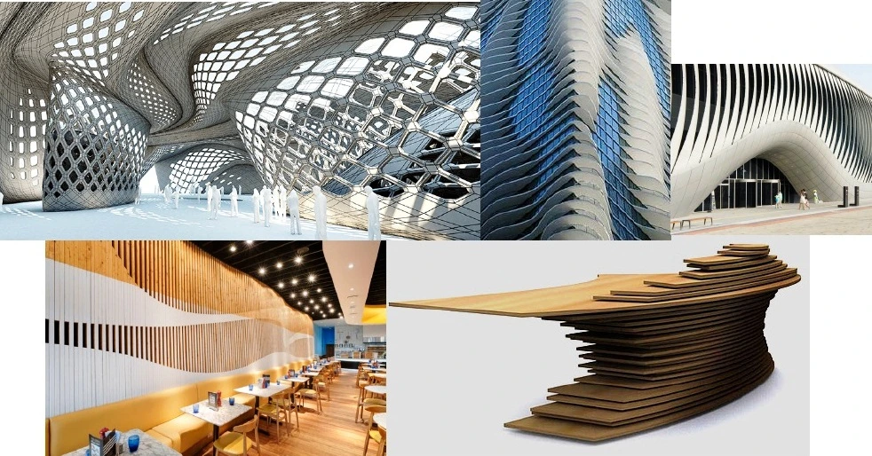
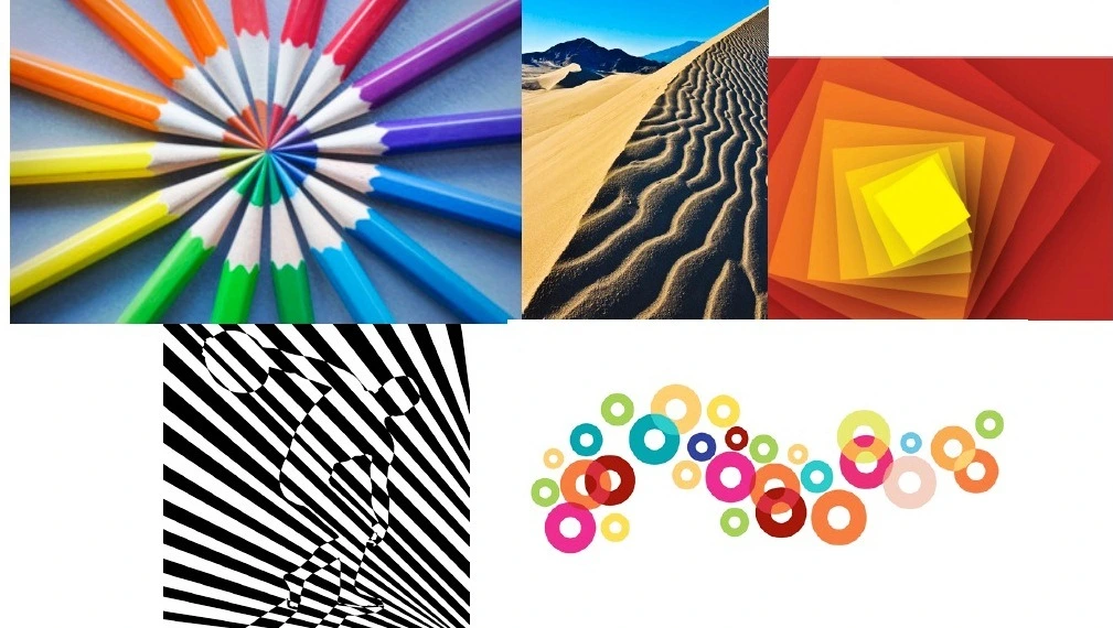
5) Movement
- Movement is the visual progression of your Design.
- The way you intend your watcher’s eye to follow.
- You can make this by deliberately putting art elements in a manner that makes a way for the eye to follow.
- Is a visual course through the synthesis.
- It very well may be the recommendation of movement in a design as you move from object to protest via situation and position.
- Directional movement can be made with a worth example.
- It is with the situation of dim and light zones that you can move your consideration through the arrangement
- A work of art may fuse genuine movement; that is, the craftsmanship itself moves here and there Or it might fuse the hallucination of, or inferred movement.
- Workmanship that travels through the impact of characteristic properties, either its own inalienable properties or their impact, is erratic.
- Spatial connections inside the work change ceaselessly, with unlimited conceivable outcomes.
6) Harmony
- Harmony means forming a consistent or orderly or pleasing or agreeable whole. A harmonious composition is concordant and free from dissent or ill-feeling.
- Harmony brings togetherness in a composition. If a composition was using wavy lines and organic shapes the designer would stay with those types of lines and not put in just one geometric shape.
- Harmony can be seen as similar to Unity -some sources list both terms to mean the same spirit.
- Harmony is required within each element and as a whole. Harmony can affect the emotional response to the composition
- Harmony in painting is the visually satisfying effect of combining similar, related elements. e.g.. adjacent colors on the color wheel, similar shapes etc.
- Harmony in visual plan implies all pieces of the visual picture relate to and supplement one another. Harmony pulls the bits of a visual image together.
- Harmony can be accomplished through repetition and rhythm.

There are two types of Harmony
i) Harmony by Unity
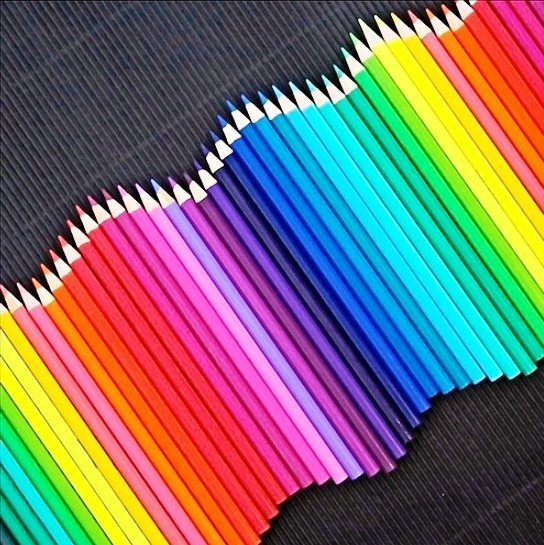
- Unity occurs when all the parts of a design or composition are related by one idea.
- A unified design has consistency of style.
ii) Harmony by Variety
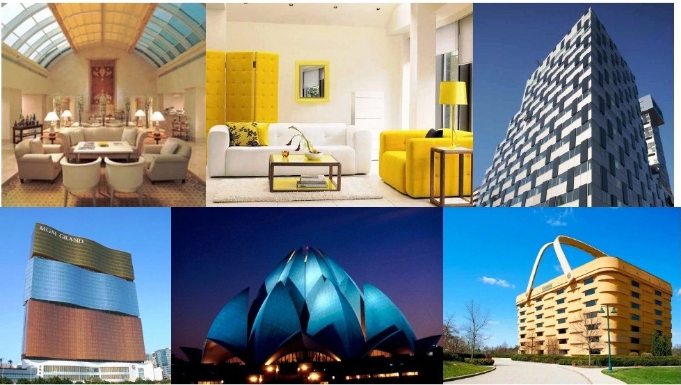
- When multiple elements of design are used to add interest to a design.
- Variety can be created using different elements and materials, as long as they are compatible to each other.


7) Alignment
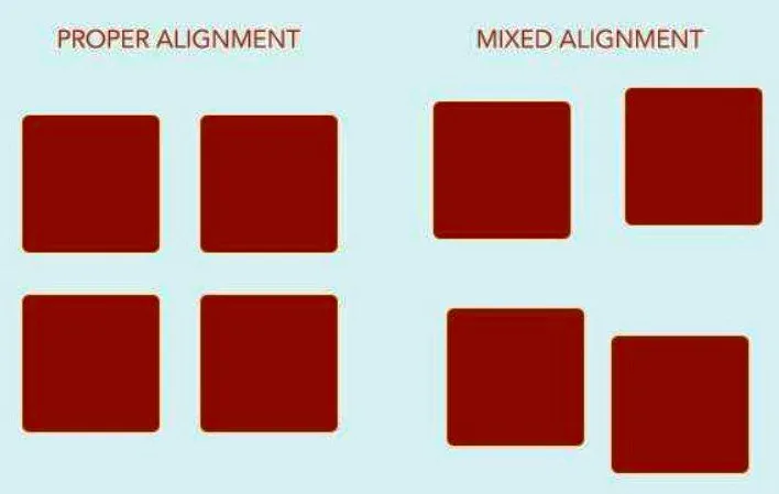
- Order in a composition can be achieved by putting objects in a certain arrangement where these all seem connected.
- The easiest order is when the objects are put in alignment with each other.
- This is true about all situations. When cars are parked according to the parking slots they look much more organized.
- The same is noticed on a composition of a printed page.
- By now you would have started appreciating that a beautiful composition can not be produced arbitrarily.
- It requires a system and deep thought and some idea for it to look appealing.
- While the principles of design are simple words these are very important for designers.
- Consciously think of these while designing.
- Allows us to create order and organization.
- Aligning elements allows them to create a visual connection with each other.

8) Repetition

- A composition is made of several objects. If all the objects are different, then the composition would become chaotic.
- Repetition thus is essential.
- Total repetition of the same object may become ‘boring’.
- Certain variety thus also becomes essential.
- Repetition strengthens a design by tying together individual elements.
- It helps to create association and consistency.
- Repetition can create rhythm (a feeling of organized movement).

- Repetition involves the use of patterning to achieve timed movement and a visual “beat”. This repetition may be a clear repetition of elements in a composition, or it may be a more subtle kind of repetition that can be observed in the underlying structure of the image.
- Rhythm can be described as timed movement through space; an easy, connected path along which the eye follows a regular arrangement of motifs.
- The presence of rhythm creates predictability and order in a composition.
- Repetition with variation is interesting, without variation repetition can become monotonous.
- Alternation is a specific instance of patterning in which a sequence of repeating motifs are presented in turn; (short/long; fat/thin; round/square; dark/light).
9) Gradation
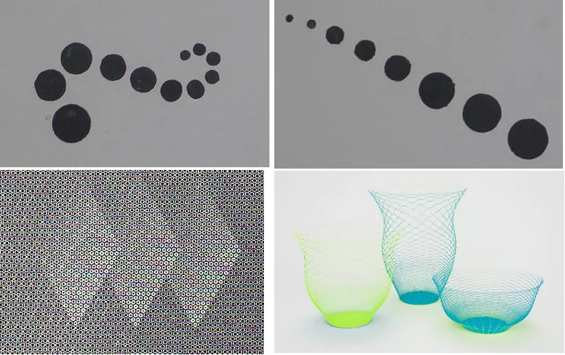
- Gradation of size and direction produce linear perspective. Gradation of color from warm to cool and tone from dark to light produce aerial perspective.
- Gradation can add interest and movement to a shape.
- A gradation from dark to light will cause the eye to move along a shape.
- Gradation employs a series of motifs patterned to relate to one another through a regular progression of steps.
- This may be a gradation of shape or color. Some shape gradations may in fact create a sequence that is suggestive of movement or depth.



i love this it is really helping us student architecture
I ran across the site looking for articles on proportion and have been sucked in by all these wonderful articles. Whoever is writing these REALLY knows what they are doing. I can tell because of the density of information and careful selection of the different graphical displays. It’s very impressive. You’ve packed an extraordinary amount of information in a small space.
Thanks, I know this took a lot of thought.
loved it!!