If you want to know about the elements of design or theory of color or objective of design, please click the link.
The theory of proportion is a fundamental principle in design, architecture, and art that focuses on the balanced and harmonious relationship between the elements in a composition.
In classical architecture and design, the theory of proportion was expressed through the use of mathematical ratios and geometric forms. For example, the golden ratio, which is approximately 1:1.6, was often used as a guideline for proportioning buildings and other structures.
There are several theories of proportioning methods used in design, architecture, and art:
- Golden section or ratio
- Regulating lines
- Classical orders
- Renaissance theories
- Le Modulor
- Ken
- Anthrophometry
These theories of proportioning methods created were utilized to shape architecture in different periods and nations.
1) Golden section
The golden section, also known as the golden ratio or divine proportion, is a mathematical concept that refers to the ratio of two quantities where the ratio of the smaller quantity to the larger one is equal to the ratio of the larger quantity to the sum of both quantities.
The golden section is approximately equal to 1.6180339887 and is represented by the Greek letter phi (φ). It is widely believed to be aesthetically pleasing and has been used in various fields including architecture, art, and design.
- The Greeks have discovered that nature utilizes a proportion law called Golden section (and Fibonacci Series), which produces things that look satisfying to us.
- Golden Section is fundamentally portrayed as the law of wonderful proportions.
- As indicated by this law, two amounts are supposed to be in the golden section (φ) if the ratio of the amount of the amounts to the bigger amount is equivalent to the ratio of the bigger amount to the more modest one.

Here, the Greek letter phi ( φ ) speaks to the golden section (or ratio). Its worth is:

On this premise, a golden rectangle is:
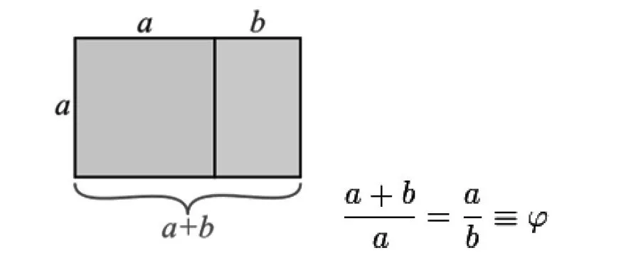
- A rectangle whose sides are proportioned by Golden Section is known as a Golden Rectangle.
- On the off chance that a square is attracted its more modest side, the leftover bit of the rectangle would be a more modest however comparative Golden Rectangle.
- This operation can be rehashed inconclusively to create a degree of squares and golden rectangles.
- In this framework, each part stays like the entirety of different parts, just as to the entirety.
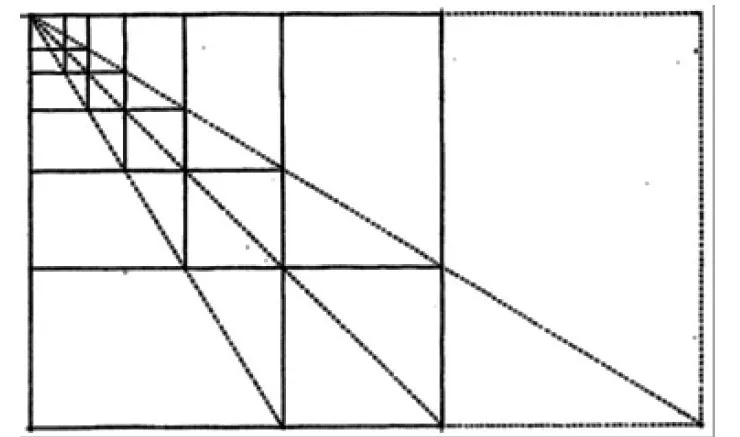
- On the off chance that a Golden section rectangle is partitioned by attracting a square it, the excess rectangle is again a golden section rectangle.
- On the off chance that that leftover rectangle is isolated again and this is proceeded until no more squares could be drawn, in the arising design, the edges of the rectangles could be associated as to frame a logarithmic twisting.
- It was discovered that the examples of seeds in plants and furthermore nautilus shells follow this logarithmic winding.

- In science, the progressive proportions of a series of numbers, which are called Fibonacci numbers, give the Golden Ratio. In these series, a number is the amount of the two continuous numbers before itself.
- In the event that a Fibonacci number is separated by its nearby archetype in the arrangement, the remainder approximates φ (like: 13/8= φ).
- The bigger the numbers get, the closer it approximates φ. Fibonacci numbers are in the accompanying number grouping:
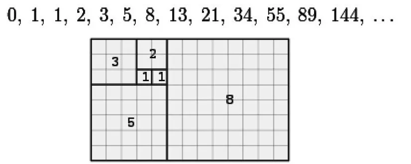
- A tiling with squares whose sides are progressive Fibonacci numbers long. Fibionacci series show themselves in the spreading in trees, the game plan of leaves on a stem, the course of action of a pine cone and so forth.
Nature and Golden Section
- Nature (the leaves, the trees, the creatures, and human creatures) creates and becomes as indicated by Golden Section (or Fibonacci series).

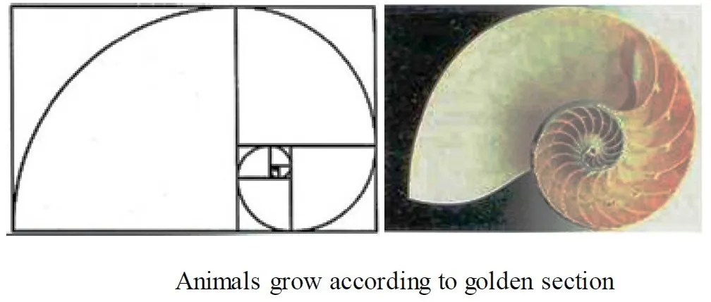

- Human creatures likewise are proportioned by Golden Section. Human hands, arms, ears, teeth, and so on are in phi (golden section) proportions.
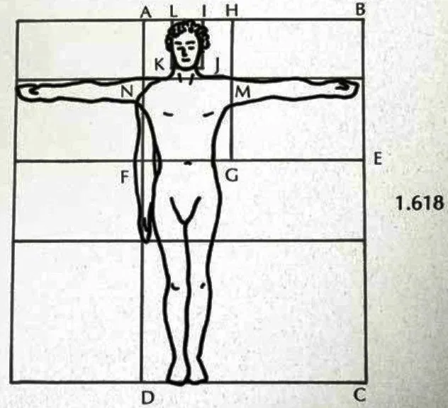
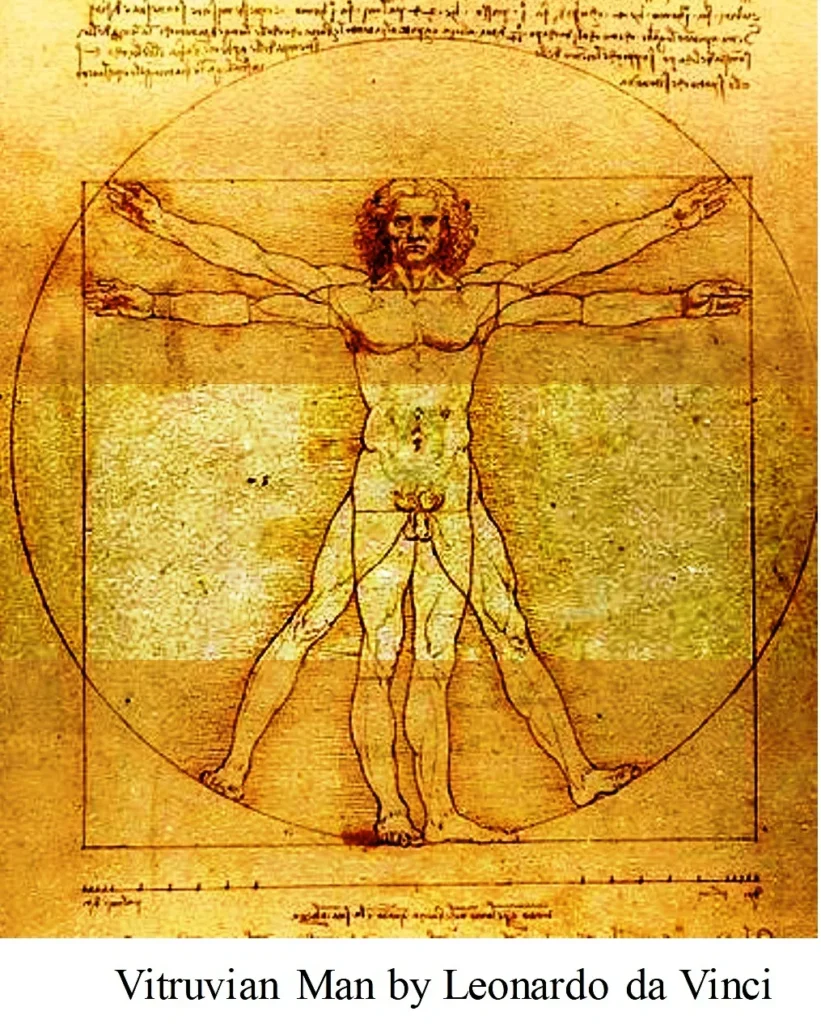
- One of the primary names who contemplated human measurements and proportions as indicated by Golden Section is Leonardo da Vinci.
- In his celebrated “Vitruvian man”, he drew the ideal man, in view of the relationships of ideal human proportions with calculation portrayed as by the ancient Roman architect Vitruvius.
- Vitruvius declared that ideal man’s proportions depended on Golden Section.
Arts and Golden Section
- Leonardo Da Vinci utilized the Golden Section widely.
- In Da Vinci’s “The Last Supper” for model, all the critical elements of the room and the table depended on the Golden section (which was referred to in the Renaissance period as The Divine Proportion).
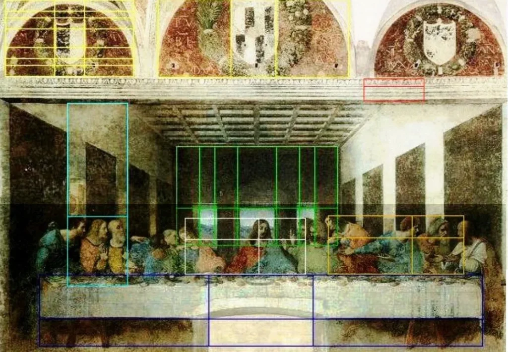
- Da Vinci’s “The Last Supper”, the progressive divisions of each section of the artwork by the golden section characterize the critical components of arrangement.
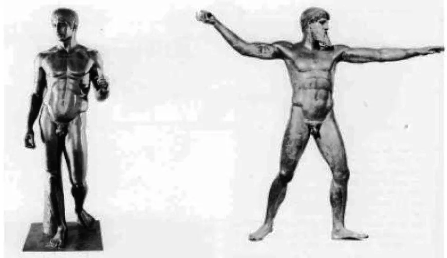
- Golden section was additionally utilized in models:
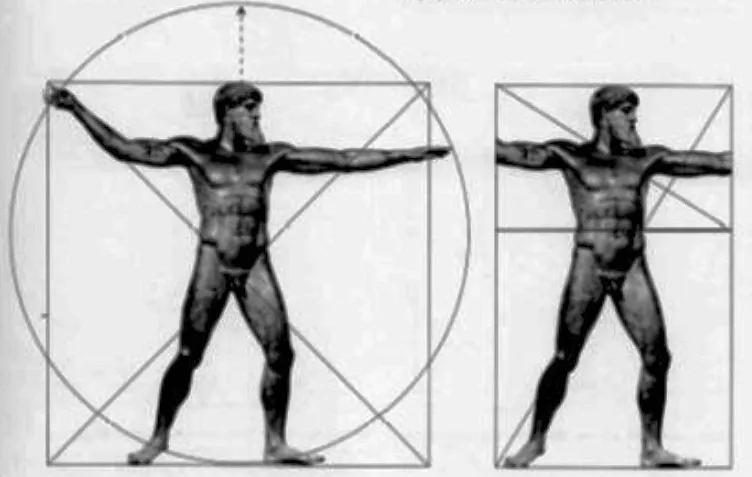
Architecture and Golden Section
- Phi (Φ), the Golden Section, has been utilized by mankind for quite a long time in architecture.
- Its utilization began as ahead of schedule likewise with the Egyptians in the plan of the pyramids.
- At the point when the fundamental phi connections are utilized to make a correct triangle, it shapes the elements of the extraordinary pyramids of Egypt, with the calculation appeared underneath making a point of 51.83 degrees, the cosine of which is phi, or 1.618.

- The Greeks utilized golden section widely for excellence and equilibrium in the plan of the Parthenon and other architectural works
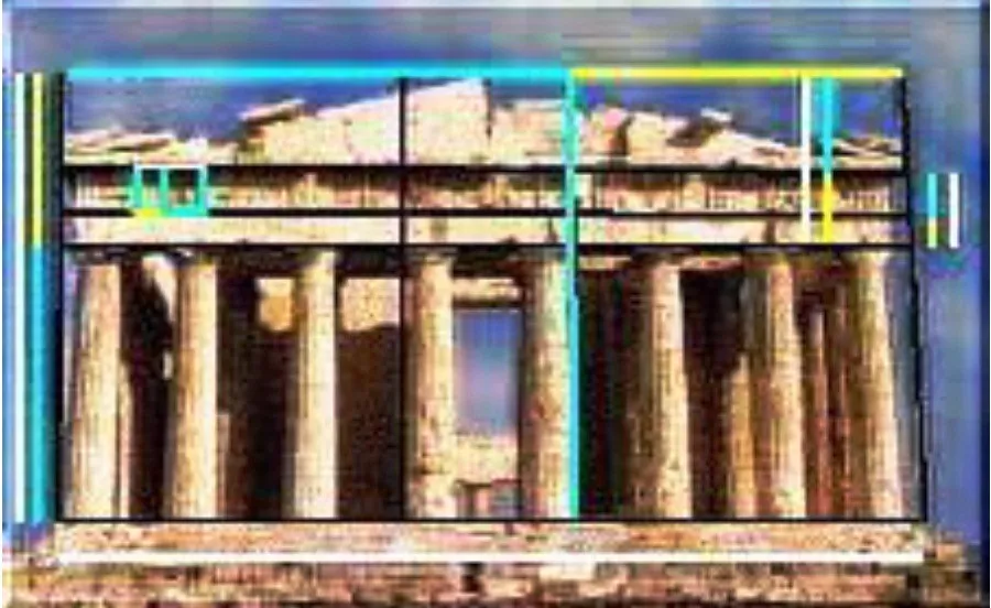
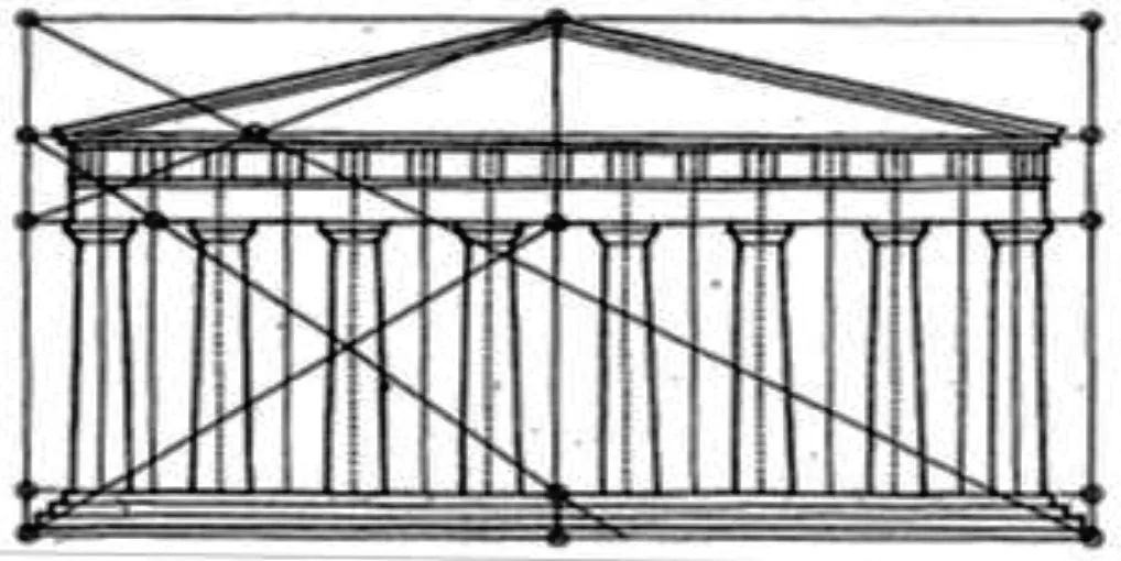
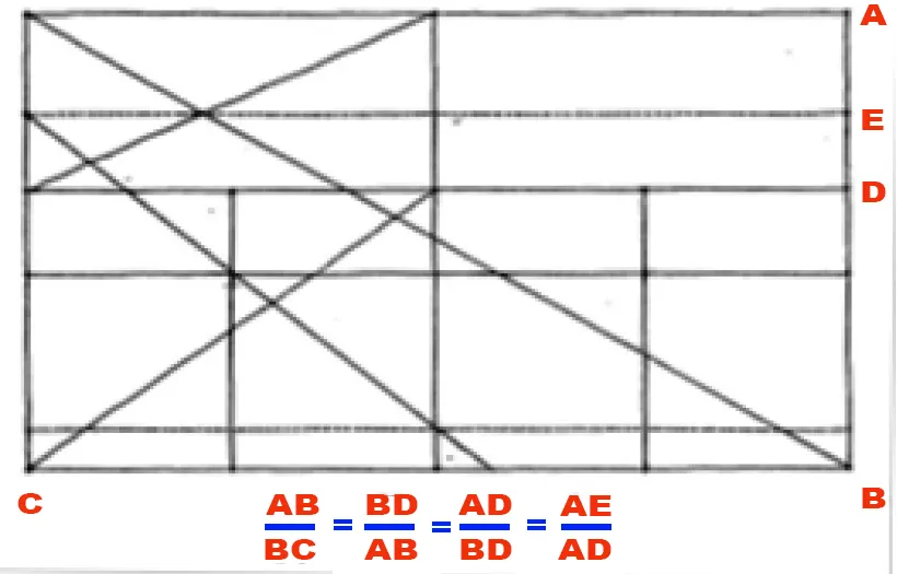
- Parthenon, Athens – Golden section was utilized in the proportioning of the façade
- Golden section was utilized it in the plan of Notre Dame in Paris, which was worked in the 1163 and 1250.
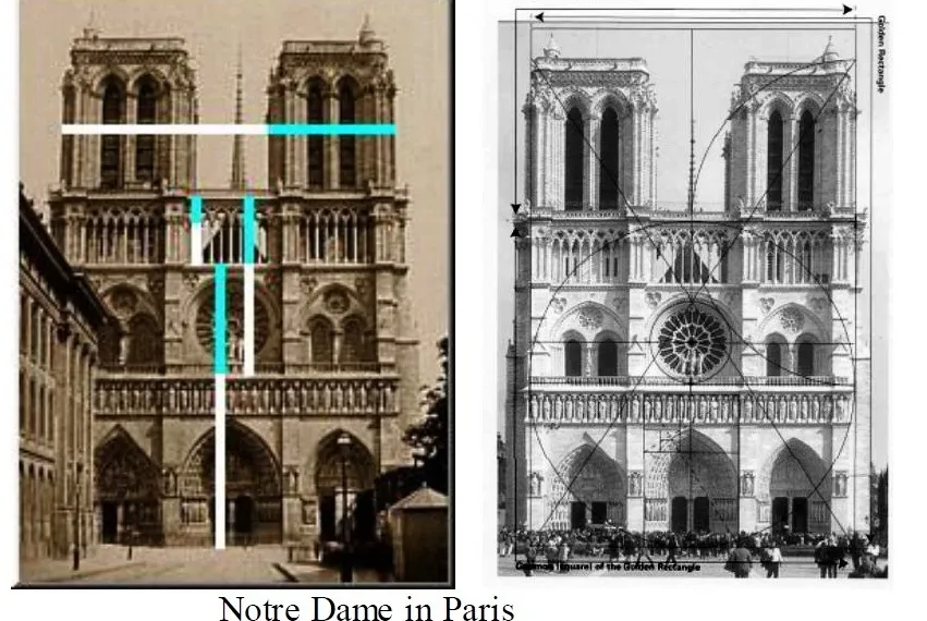
- It was additionally utilized broadly by Renaissance craftsmen of the 1500′s. it was called as the Divine Proportion in this period.

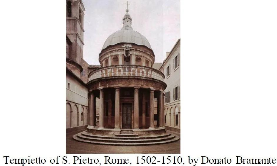

- In India, it was utilized in the development of the Taj Mahal, which was finished in 1648.
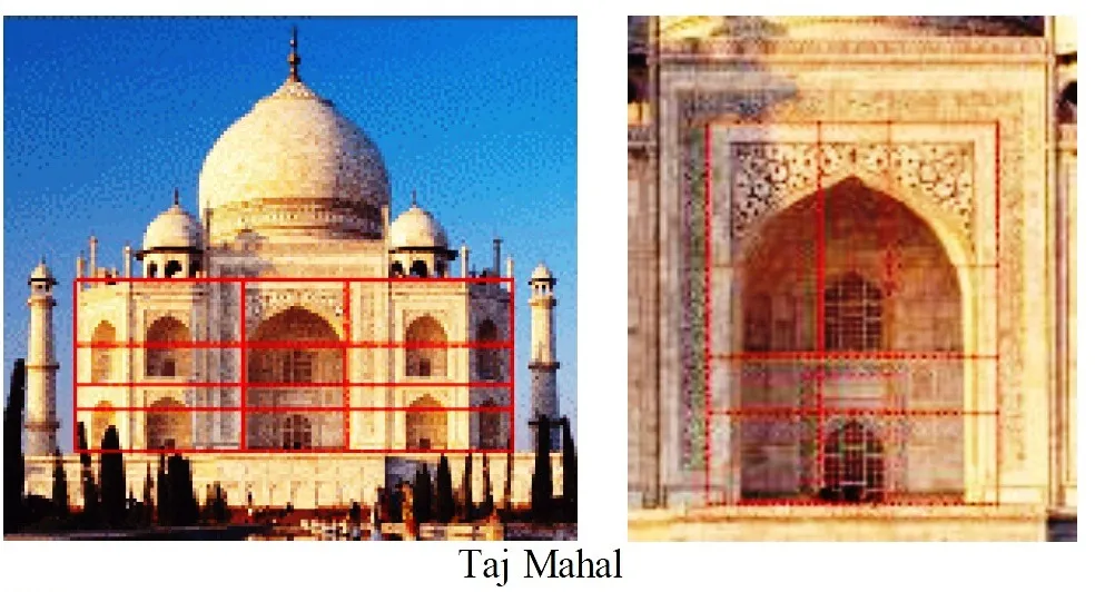
- Its utilization proceeds in current architecture, as delineated in the United Nations Building.

- The CN Tower in Toronto, the tallest pinnacle and detached structure on the planet, additionally contains the golden ratio in its plan.
- The ratio of perception deck at 342 meters to the complete stature of 553.33 is 0.618 or (the complementary of Phi).

2) Regulating lines
Regulating lines are lines used in architectural and design drawings to ensure proportions and symmetry in a building or structure. They serve as a reference for placement of elements and help to maintain the desired proportion and balance in the design.
Regulating lines are typically drawn perpendicular to the main axis of the design and are used to align elements such as windows, doors, and other architectural features. They can also be used to divide a building into sections or to define specific zones.
The use of regulating lines is an important aspect of classical architectural design and continues to be used in modern architectural practice.
- The lines that show the normal arrangement of elements are called regulating lines. They are utilized to control the proportion and position of elements in architecture. They console the impression of order and fix the basic calculation of work.
- Le Corbusier was a celebrated ally of regulating lines and called them as the inescapable component of architecture and the need for order. He contended that extraordinary architecture of the past has been guided by these regulating lines and these lines, beginning at critical regions of the fundamental volumes, could be utilized to justify the situation of highlights in buildings. He recommended that the regulating lines of forms (or the mathematical laws of a specific form) should be the reason for resulting activity.
- When these mathematical laws are perceived and the lines are drawn, different tomahawks can be followed and the properties of forms (regardless of whether they are straight, or centroidal, static or dynamic) can be recognized.
- As indicated by Corbusier, regulating lines ensure fine proportions and add a judicious feeling of soundness to the buildings. Along these lines, the order, the function, and the volume of the space are brought into one design entirety.
- He clarified this as follows: ” The regulating line is an assurance against tenacity. It carries fulfillment to the arrangement. The regulating line is an unfortunate obligation. It’s anything but a formula. Its decision and the modalities of articulation given to it are an indispensable piece of structural creation.” (Le Corbusier, Towards New Architecture)

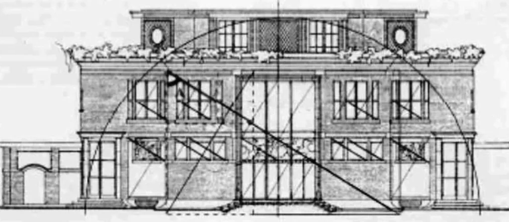

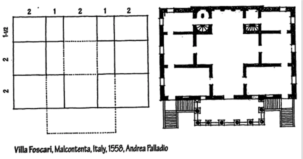
- In his paper “The mathematics of the ideal manor”, Colin Rowe called attention to the similitude between the spatial development of a Palladian estate and the primary framework of a manor by Le Corbusier (Villa Garches).
- While the two manors shared a comparable proportioning framework, Palladio’s estate comprised of spaces with fixed shapes and consonant interrelationships.
- He utilized basic proportions of 3:4, 4:4, 4:6, as in melodic harmony. The guest feels these proportions. Not as careful proportions but rather as the thought behind them.
- He/she feels that there is a coordinated creation, where each part has an importance according to the entirety.
- Le Corbusier’s manor then again was made out of flat layers of free space.
- The rooms shifted fit as a fiddle and were asymmetrically masterminded in each level.
- The mathematical net of underlying elements is fundamentally the same as Villa Foscari as far as their proportions.
- Corbusier tells that he has utilized the proportion of 5:8, which is exceptionally near Golden section.
- Anyway here, the guest can not see any proportional framework that is utilized in plan, since Corbusier deliberately stifles the underlying elements.
- In this way in spite of the fact that the underlining arrangement of proportions is comparable, there is no comparability in the standards of sythesis of these two buildings.
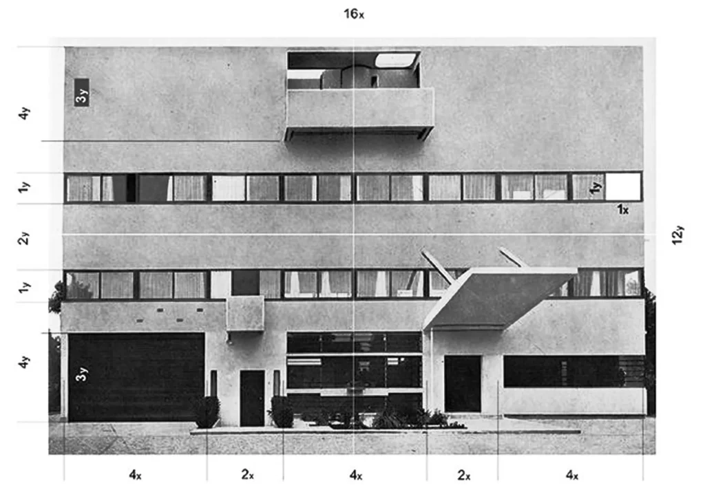
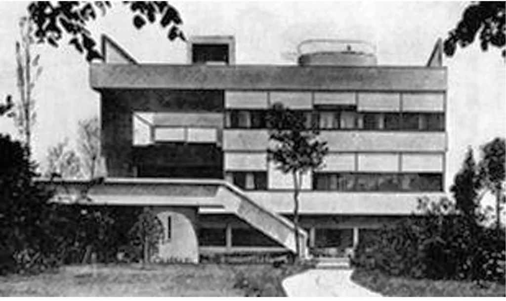
Villa Garches by Le Corbusier
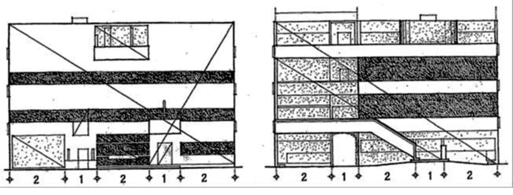
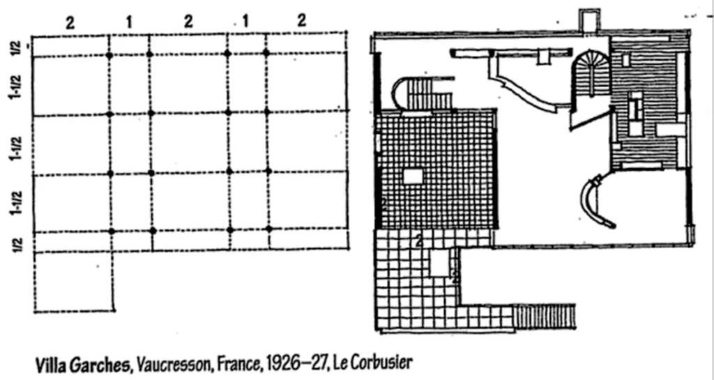

3) Classical Order
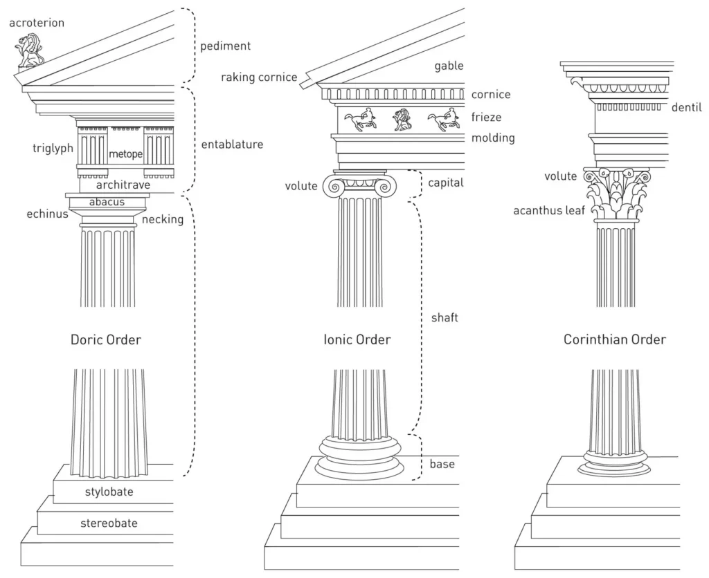
Classical order is one of the old styles of classical architecture, recognized by its extents and trademark subtleties, and generally by the sort of column employed.
- It is a method of proportioning the elements.
- Three old orders of engineering—the Doric, Ionic, and Corinthian—began in Greece.
- To these the Romans added the Tuscan, which they made easier than Doric, and the Composite, which was more elaborate than the Corinthian.
- To Greeks and Romans, the Orders spoke to the ideal beauty and harmony.
- The essential unit of measurement was the width of the column.
- From this module, the elements of the shaft were determined, just as the elements of the capital, the pedestal underneath and the entablature above.
- The spaces between the columns were additionally founded on the distance across of the column.
- In this framework, the goal was to guarantee that the entirety of the pieces of any one structure were proportionate and in harmony with each other.
The Parthenon is a sanctuary of the Doric order with eight columns at the façade, and seventeen columns at the flanks, adjusting to the set up proportion of 9:4.
This proportion represented the vertical and level extents of the sanctuary just as numerous different connections of the structure like the separating between the columns and their stature.

Parthenon, in Athens, Greece, 432 BC
If you want to know about the classical orders of architecture, please click the link.
4) Renaissance Theories
- The architects of the Renaissance, accepting that their buildings needed to have a place with a higher order, gotten back to the Greek mathematical arrangement of proportions.
- Similarly as Greeks believed music to be the calculation deciphered in sound, the Renaissance architects felt that design was science converted into spatial units.
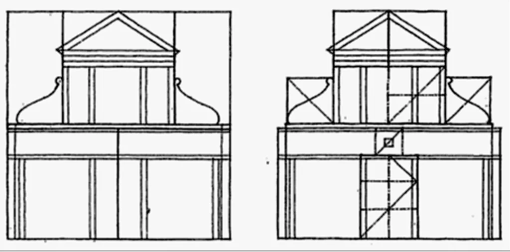
- They applied the proportioning framework created by Pythagoras (which depended on musical scale), and built up a movement of proportions that shaped the premise of their design.
- These proportions showed themselves not just in the components of a room or façade, yet in addition in the relationship of spaces in the plan.


- Andrea Palladio (1508-1580) was presumably the most persuasive planner of the Italian Renaissance.
- He was affected by Roman and Greek architecture, primarily by Vitruvius.
- He utilized classical principles to plan a progression of country villas and urban palaces royal residences for the respectability of Vicenza.
- He openly recombined elements of Roman buildings in his own structure locales as per contemporary necessities (making houses with temple fronts).
- Simultaneously he shared the Renaissance worry for harmonious proportion.
- He imagined that beauty will emerge from the connections of the parts to one another and to the entirety.
- His veneers have an imperative effortlessness emerging from the utilization of proportions.
- One of his most celebrated is Villa Capra, otherwise called the Rotunda, which was designed according to the Roman Pantheon.
- Palladio affected British American and European engineering in the previous 400 and fifty years, principally due to his book Four Books on Architecture.
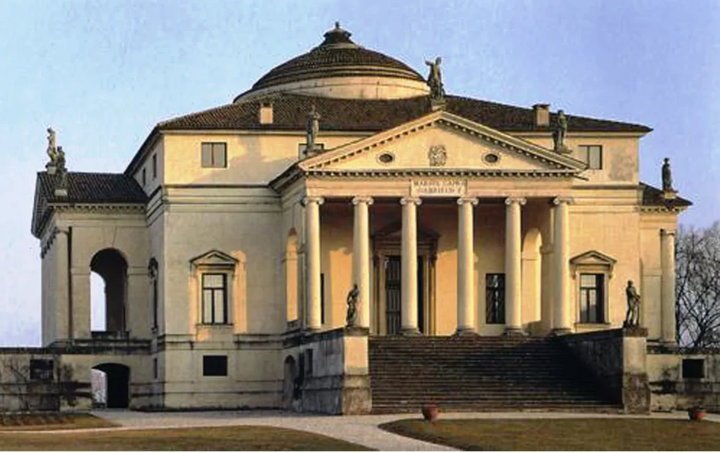
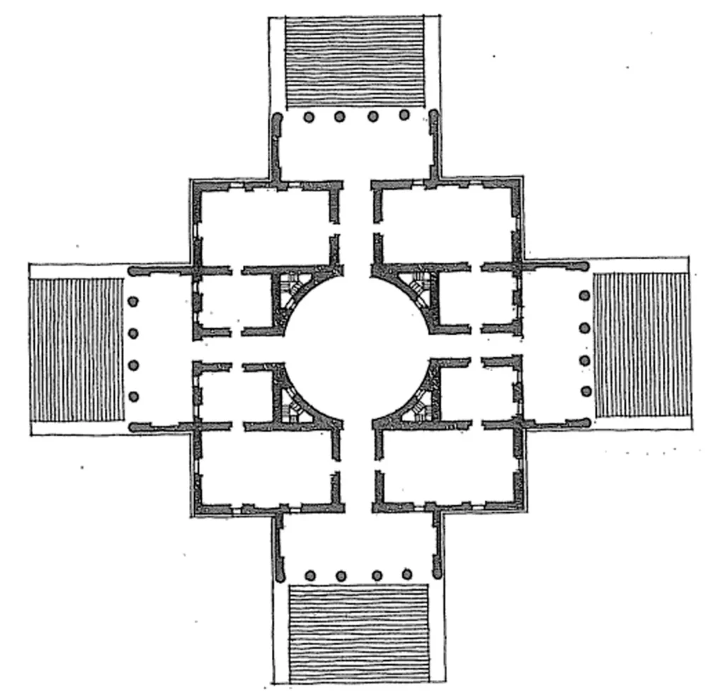
Villa Capra (or Villa Rotunda) by Palladio, Vicenza, Italy (1552-67)

Villa Barbaro by Palladio
5) Le modulor
- The acclaimed architect Le Corbusier likewise worked with human proportions and Golden Section.
- He has built up a theory of proportion and dimensioning framework, named Modulor that depends on Golden Section and human proportions.
- He had shaped the proportions of human body as indicated by Fibonacci series and acknowledged the normal human stature as 183 cm (He discovered that tallness likewise as per Fibonacci Series).
- As indicated by that, he had created two series of dimensions, first as per the full stature of the man, which is 183 cm (red series) and the second as per the tallness when he lifted his arm, which is 226 cm (blue series).
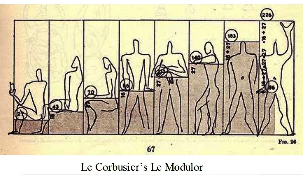
- He built up this framework for the sequential creation of standard furnitures and for deciding the lengths, heights and widths of inward spaces.
- He accepted that Le Modulor fulfilled both the requests of beauty (since it is gotten from Golden section/Fibonacci series) and furthermore functional requests.
Red series: 4-6-10-16-27-43-70-113-183 cm. Blue series: 13-20-33-53-86-140-226 cm.
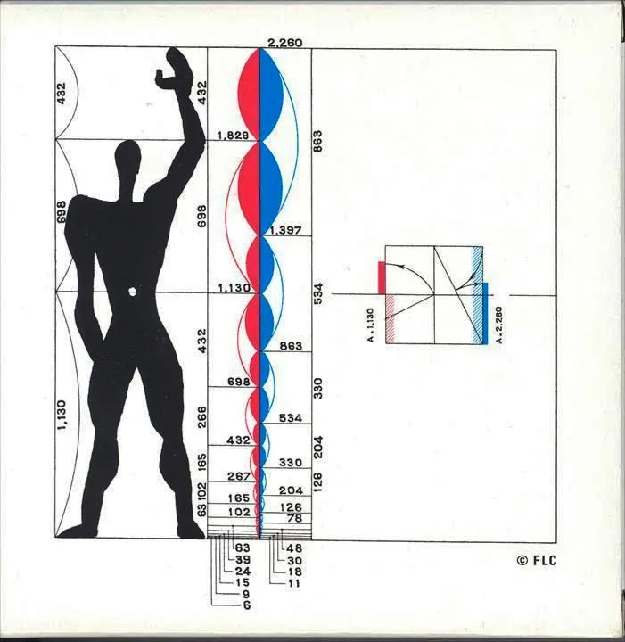
Le Modulor by Le Corbusier
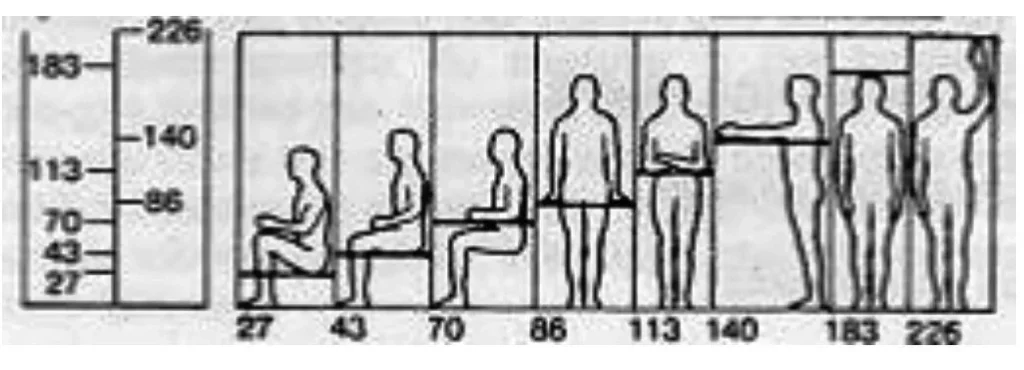
These proportional dimensions were utilized for recognizing the accompanying dimensions:
- 27 cm. – the height of the easy chair while sitting
- 43 cm – the height of the seat
- 70 cm – the height of the table
- 86 cm – the height of the ledge
- 113 cm – the height of the bar
- 140 cm – the height of the easy chair flat arm
- 183 cm – human height
- 226 cm – human height with arm lifted up
- Le Corbusier used his Modulor dimensions in the design of Unite d‘Habitation Residential Block in Marseilles, France. He used 15 measures of Modulor to bring human scale to the huge building, which is 140 m‘s long, 24 m‘s wide and 70 m‘s high.

Le Corbusier‘s Unite d‘Habitation in Marseilles, France
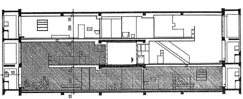
Section, Le Corbusier‘s Unite d‘Habitation in Marseilles, France
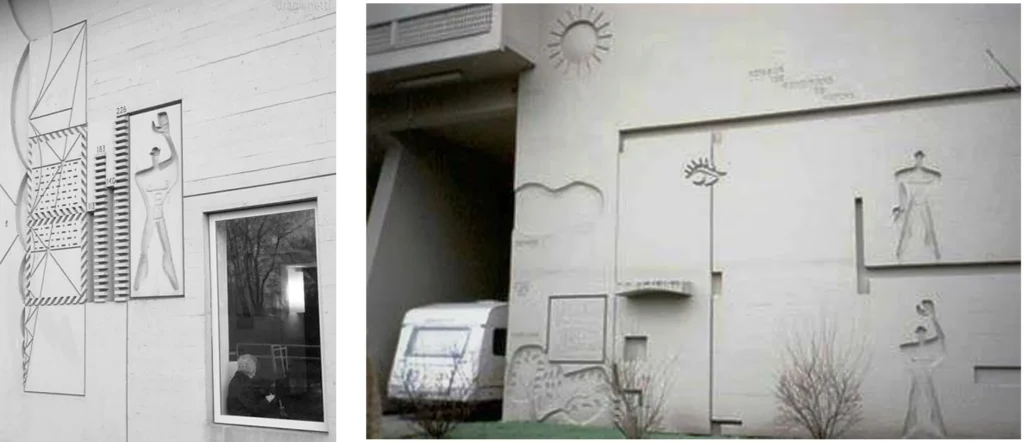
Modulor carvings in the facades, Le Corbusier‘s Unite d‘Habitation in Marseilles, France
6) Ken
- Ken is the Japanese unit of measure. It initially assigned the stretch between two segments (columns) and it was normalized later for residential architecture.
- Ken was utilized as the absolute measurement for the development of buildings and as a tasteful module that ordered the structure, materials and space of Japanese architecture.
- Along with ken, another module additionally influenced the plan of Japanese spaces, which was the tatami (or the customary Japanese floor mat).
- Tatami was initially proportioned to oblige two people sitting or one individual resting.
- The more modest side of a tatami was equivalent to the size(s) of ken and two kens rose to the length of a tatami.
- The Japanese inward spaces were shaped by ken modules and the position of tatamis.
- The size of a room was assigned by the quantity of tatamis.

Traditional Japanese house and the utilization of ken modules
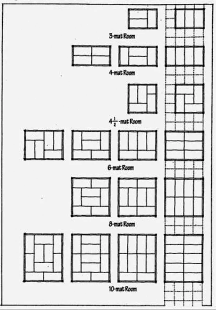
Traditional Japanese house and the utilization of ken modules

- In a traditional Japanese house the ken (grid orders) framework arranges the structure just as the added substance succession of rooms.
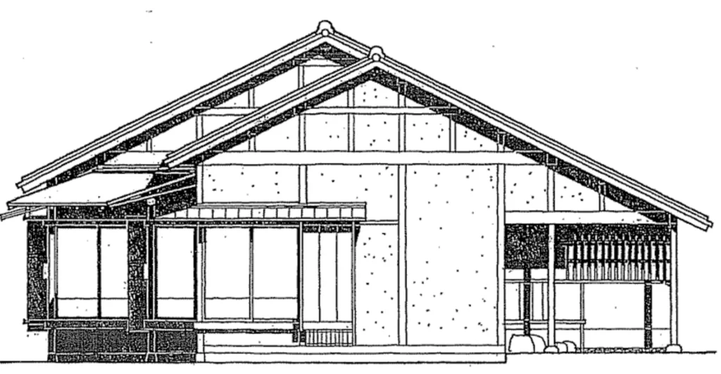
Traditional Japanese house – east elevation
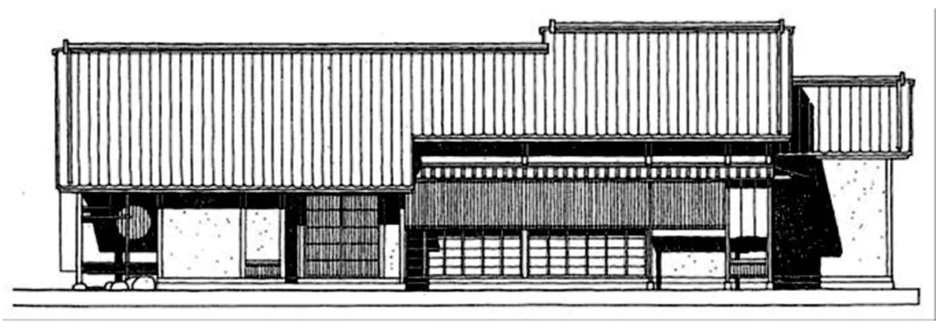
Traditional Japanese house – north elevation
7) Anthropometry
- Anthropometry alludes to the size and proportions of the human body. Anthropometric proportioning techniques look for the functional measurements for the human body.
- They state that forms and spaces in architecture are either holders or augmentations of the human body and in this manner they should be designed by its measurements.
- The sizes and states of building elements and segments are the results of human measurements and his/her specific capacities.
- Each furniture that man made are delivered by his/her measurements. Hence, previously, measurements of human organs, (for example, the finger, foot, arm and so forth) were utilized as the standard measurement units:
British:
- Inch (One finger): 2.54 cm.
- Foot (One foot): 30.48 cm.
- Yard (Three feet): 91.44 cm.
Turkish:
- Endaze (One open arm): 65.25 cm.
- Arşın (One open arm+1/4 chest): 68.58
- In like manner, the measurements and measurements frameworks we use today have been originated from human proportions and measurements.
- Human being is the premise of all dimensions.
- Human measurements and the relations between those measurements (proportions) have been read for quite a while.
- Anthropometrics manages this subject and distinguishes those measurements, in light of the fact that the measurements and proportions of the human body influence the proportion of the things we handle, the components of our furniture, and the elements of the spaces we use.
For this reason, in order to coordinate the design of devices, systems, and environments with our physiological and psychological capacities and requirements, another branch of science emerged, which is called ergonomics.
- The fit among structure and measurements of a space and our own body measurements can be a static one as when we sit in a seat, or incline toward a divider, and can be a powerful one as at the point when we stroll up a flight of stairs or travel through the rooms of buildings.
- A planner should plan and design his buildings as per human measurements in an ergonomic way.
- He/she should design the furnitures as indicated by human measurements and design spaces according to those furnitures.
- Buildings scaled to human measurements and actual capacities in an ergonomic manner have structural elements, for example, steps, entryways, railings, work surfaces, seating, shelves, apparatuses and so forth that fit well to the normal individual.
- Also, the spaces that are left between these elements should be organized cautiously so a human being can act and move efficiently between them.
- The components of these spaces and the circulation areas are determined as indicated by the elements of furniture and the standard elements of a human being in static and dynamic positions.
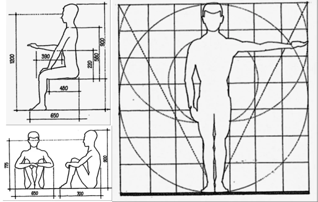
- Spaces could be framed via taking human measurements and the furniture he/she utilizes as the premise.
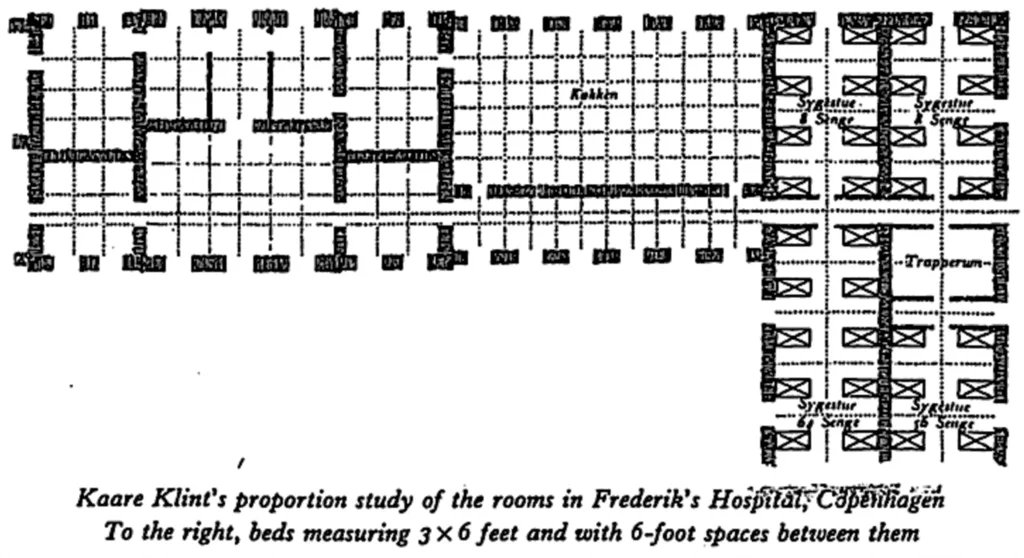
- For instance, the plan of Frederik’s Hospital in Copenhagen, designed by Danish designer Nicolai Eigtvet, was shaped by taking the emergency clinic bed as the module, which was put in 180 cm from different beds.
- In this building the measurements were not controlled by brilliant segment or modulor, yet by the beds which the medical clinic was constructed to hold.
A wonderful article