If you want to know about objective of design or origin of architecture or theory of proportion, please click the link.
There are three basic categories of color theory that are logical and useful.
- Color wheel
- Color harmony
- The context of how colors are used
Color theories create a logical structure for color.
1) Color Wheel
- History of the color wheel – The first color wheel has been attributed to Sir Isaac Newton, who in 1706 arranged red, orange, yellow, green, belue, indigo, and violet into a natural progression on a rotating disk.

- As the disk spins, the colors blur together so rapidly that the human eye sees white.
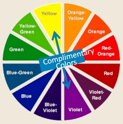
- Modern-day color wheel – Colors opposite each other on the wheel are called complementary colors.
- Analogous colors, those next to each other, can also be combined successfully.
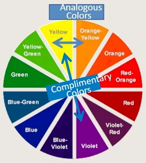
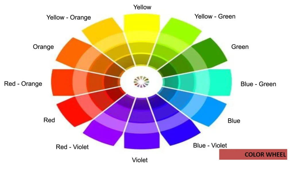
- The color wheel shows relationships between the colors.
- Artists often use the color wheel to help understand how colors relate to one another.
- The color wheel, a color circle, based on red, yellow and blue, is traditional in the field of art.
- Since then scientists and artists have studied and designed numerous variations of this concept.
- Differences of opinion about the validity of one format over another continue to provoke debate. In reality, any color circle or color wheel which presents a logically arranged sequence of pure hues has merit.
Color
- Color refers to specific hues. It has 3 properties:
- Hue – Spectral color name
- Intensity – Or saturation is concerned with the brightness or dullness of a color
- Value – Relative darkness or lightness of a color
- Color wheel is a way of showing the chromatic scale in a circle using all the colors made with the primary triad.
- Black and white can be added to produce tints (by adding white), shades (by adding black) and tones (by adding gray).
- There are also definitions ( or categories ) of colors based on the color wheel.
- Primary colors
- Secondary colors
- Tertiary colors
i) Primary Colors
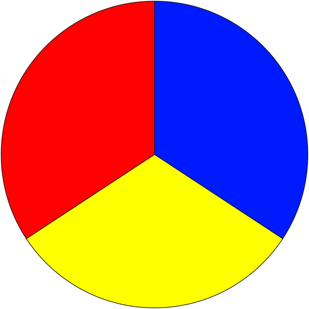
- Red, yellow and blue
- In traditional color theory (used in paint and pigments), primary colors are the 3 pigment colors that cannot be mixed or formed by any combination of other colors.
- All other colors are derived from these 3 hues.
ii) Secondary Colors
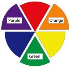
- Green, orange and purple
- These are the colors formed by mixing the primary colors.
iii) Tertiary Colors
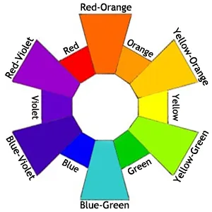
- Yellow-orange, red-orange, red-purple, blue-purple, blue-green & yellow-green
- These are the colors formed by mixing a primary and a secondary color.
- That’s why the hue is a two word name, such as blue-green, red-violet, and yellow-orange.
2) Color Harmony
- Harmony can be defined as a pleasing arrangement of parts, whether it be music, poetry, color, or even an ice cream sundae.
- In visual experiences, harmony is something that is pleasing to the eye.
- It engages the viewer and it creates an inner sense of order, a balance in the visual experience.
- When something is not harmonious, it’s either boring or chaotic.
- At one extreme is a visual experience that is so bland that the viewer is not engaged.
- The human brain will reject under-stimulating information.
- At the other extreme is a visual experience that is so overdone, so chaotic that the viewer can’t stand to look at it.
- The human brain rejects what it cannot organize, what it cannot understand.
- The visual task requires that we present a logical structure.
- Color harmony delivers visual interest and a sense of order.
- In summary, extreme unity leads to under-stimulation, extreme complexity leads to over-stimulation.
- Harmony is a dynamic equilibrium.
Some Formulas for Color Harmony
- There are many theories for harmony.
- The following illustrations and descriptions present some basic formulas.
i) A color scheme based on analogous colors

ii) A color scheme based on complementary colors

- Complementary colors are any two colors which are directly opposite each other, such as red and green and red-purple and yellow-green.
- In the illustration above, there are several variations of yellow-green in the leaves and several variations of red-purple in the orchid.
- These opposing colors create maximum contrast and maximum stability.
iii) A color scheme based on nature

- Nature provides a perfect departure point for color harmony.
- In the illustration above, red yellow and green create a harmonious design, regardless of whether this combination fits into a technical formula for color harmony.
3) Color Context
- How color behaves in relation to other colors and shapes is a complex area of color theory.
- Compare the contrast effects of different color backgrounds for the same red square.
Different readings of the same color

- Red appears more brilliant against a black background and somewhat duller against the white background.
- In contrast with orange, the red appears lifeless; in contrast with blue-green, it exhibits brilliance.
- Notice that the red square appears larger on black than on other background colors.

- If your computer has sufficient color stability and gamma correction you will see that the small purple rectangle on the left appears to have a red-purple tinge when compared to the small purple rectangle on the right.
- They are both the same color as seen in the illustration below.
- This demonstrates how three colors can be perceived as four colors.

- Observing the effects colors have on each other is the starting point for understanding the relativity of color.
- The relationship of values, saturations and the warmth or coolness of respective hues can cause noticeable differences in our perception of color.
4) Color Process
Two Kinds of Color Process
i) Subtractive Color (reflected pigment)
- Color resulting from absorption of light.
- Their mixtures are governed by the rule of subtraction.
- All color, when mixed in certain proportions, the subtractive result is black.
- (pigmentary, objects, printed matter & CMYK color)

ii) Additive Color (projected light or reflected light)
- All colored light, when mixed in certain proportions, the additive result is white.
- Color resulting from projection of light.
- (TV screen, computer screen, web color & RGB color)

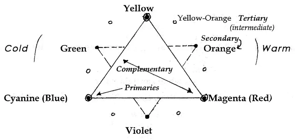
- Color Wheel of the Pigment Color (artificially augmented spectrum, added purple)
5) Three Main Qualities of Color
i) Hue (color)
- The relative position located on the color wheel.
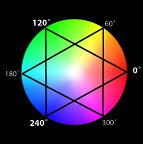
- The actual color, such as red or green.
- Hue or Spectral Colour is represented as an angle.
Primary Colours
- 0˚ = Red
- 120˚ = Green
- 240˚ = Blue
Secondary Colours
- 60˚ = Yellow
- 180˚ = Cyan
- 300˚ = Magenta
A hue can be changed by adding tone,
- Example – white to lighten, black to darken
ii) Value
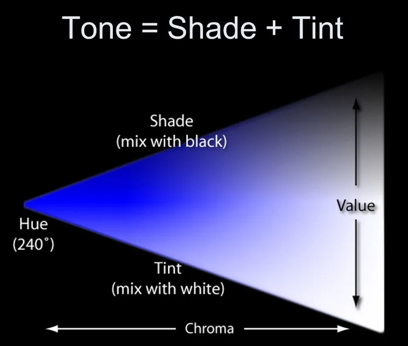
- Value, or tone, is the relative lightness or darkness of a color.
- A color with added white is called a tint and a color with added black is called a shade.

iii) Saturation ( Chroma )
- Purity of the color or The intensity of the color.
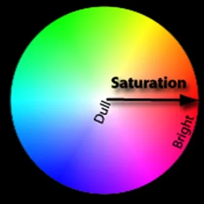
- Saturation or Chroma is the intensity of a colour.
- A highly saturated colour is bright and appears closer to the edge of the wheel.
- A more unsaturated colour is dull.
- A colour with no saturation is achromatic or in the grey scale.
6) Other definitions
i) Tints, Shades & Neutrals
Tints, shades and neutrals are those colors which are not pure and vivid. They are created in different ways
Tints
- A tint is a color in which white has been added to a pure color.
- The more white, the lighter the tint.
- Tints are otherwise known as pastels.

Shades
- A shade is a color in which black has been added to a pure color.
- The more black, the darker the tint.

Neutrals
- A neutral is the combination of complementary colors.
- Complementary colors are those that sit opposite each other on the color wheel.
- Neutrals are more natural colors and tend to be brownish.

ii) Complementary Colors

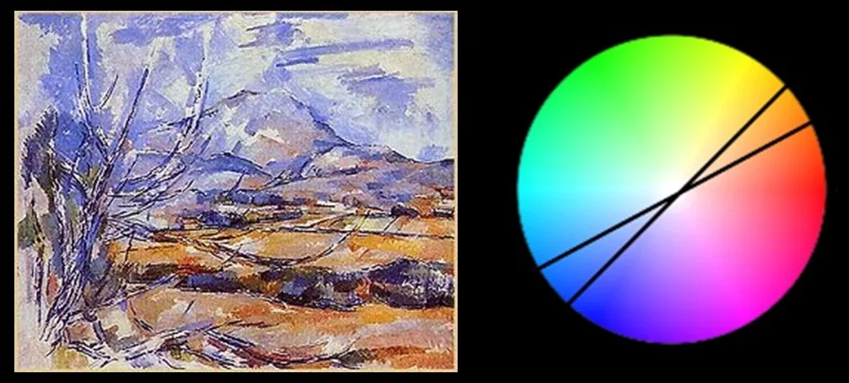
- Complementary colors are two colors which sit opposite each other on the color wheel.
- Complementary colours are often used together in a composition to create excitement.
- Each colour in the pair makes the other seem more vibrant.
iii) Analogous Colors

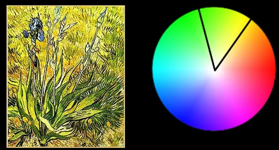
- Analogous colours are those which sit next to each other on the color wheel.
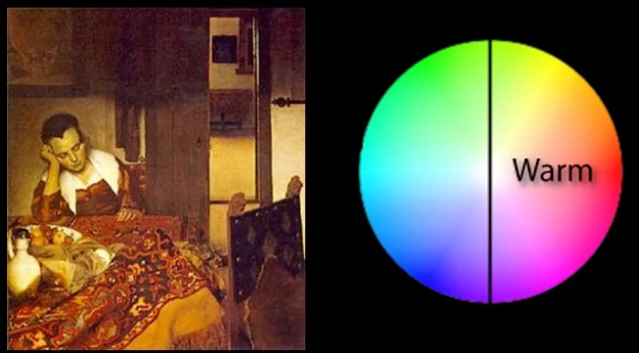
iv) Warm Colors
- Warm colors are found on the right side of the color wheel.
- They are colors found in fire and the sun.
- Warm colors make objects look closer in a painting or drawing.
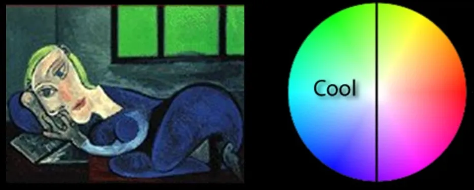
v) Cool Colors
- Cool colors are found on the left side of the color wheel.
- They are the colors found in snow and ice and tend to recede in a composition.
7) Color Expression
- The following colors evoke certain meanings in this culture.
- These subconscious perceptions, intuitive thought and positive knowledge should always function together.
- They bear some general truth, but may vary in different societies.
- They are related to the psychological realm, mental and emotional experience of the viewer.
i) Red
- Red signifies primitive & fiery strength, inner warmth, active, vivacity, passionate, dynamic force, mars, revolution.
- It can be widely varied between cold and warm.
ii) Orange
- Orange express radiant activity, communication, active energy, fire burning, solar luminosity, self-respect and generosity.
- It could be lightened to beige for a quiet and intimate interior space.
iii) Yellow
- Yellow is most luminous & bright color with the sense of radiant, weightless & pure vibration.
- It symbolizes understanding, knowledge and intelligence.
- It is most aggressive and luminous on black.
- Golden yellow represents the highest sublimation of matter, but greenish yellow is a sickly color to a lot of people.
iv) Green
- Green symbolizes growth, hope, tranquility, sympathy & compassion.
- It is the fusion & interpenetration of knowledge and faith.
- Yellow-greens are joyful, young and sunny; while blue-green are cold, pensive and vigorous.
v) Blue
- Blue express relaxation, passive, submissive faith, stability, grief & associated with nervous system.
- It symbolizes inner spiritual life, immortality and transcendental.
- Darker shades - infinity; lighter tints - dreamlike quality.
vi) Violet
- Violet is a mysterious, meditative, emotional, piety color and the color of dignity.
- Its tints symbolize the brighter aspects of life, whereas shades represent the dark, negative forces and terrors.
vii) Gray
- Gray is a neutral and the color of inertia.
- It symbolizes indecision, monotony and depression in dark tones.
8) Color and Design
- Color is all around us on all the surfaces that we see all the time.
- Anything that we design will have a color.
- Color will effect the final reaction to the design.
- Color must therefore be of a major concern for a designer.
Color use in architecture
In architecture, color can be applied to various elements of a building such as walls, roofs, facades, interiors, and landscapes. Color can also play a role in creating spatial illusions, highlight or hide specific architectural features, and even affect the energy efficiency of a building.
The theory of color in architecture continues to evolve and is a crucial aspect of the design process, influencing the overall aesthetic, functionality, and impact of a building.