
If you want to know about the theory of color or what is architecture or heat transfer in buildings, please click the link.
Color harmonies are combinations of colors that are pleasing to the eye and work well together. They are used in various fields, including graphic design, interior design, fashion, and art. The use of color harmonies can evoke specific moods and emotions, and can help to create visual interest and balance.
- Certain colour combinations give pleasure to the eye, and others offend. Until one has had a great deal of practice in combining colours it is helpful to follow those harmonies which have been used successfully by artists for many years.
- It may seem at first glance that a list of colour harmonies will give everything one needs to know about combining colours.
- Unfortunately, this is not true. As a matter of fact, some of the least beautiful as well as some of the most beautiful colour arrangements can be made by following the so-called standard colour harmonies.
The objectives of the present topic on colour harmonies is….
- To understand the types of colour harmonies
- To gain knowledge on how to apply these colour harmonies – related and contrasting
- To learn to select colour harmonies for different rooms
The standard colour harmonies are of two types namely, related colours and contrasting colour harmonies. Now let us understand the different type of colour harmonies.
1) Related colour harmonies
- In this colour scheme related colours are used. Colour schemes sharing common characteristics with one dominating colour are used in these schemes. Colours are closely situated to each other on the colour wheel and have one common colour.
- The related colour harmony schemes can be divided into…
- One-hue harmony or monochromatic
- Analogous harmony
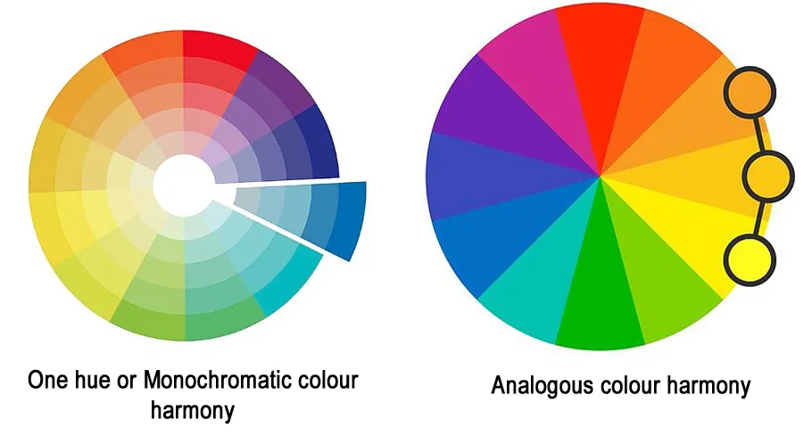
i) One hue or Monochromatic colour harmony
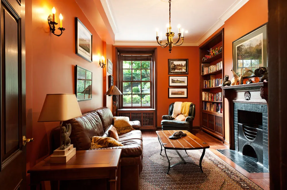
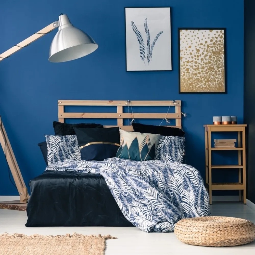
- Monochromatic: “Mono” means one and “chroma” means colour. Here only one colour is used in different values and intensities. In other words, the tints and shades of one main colouor with varying degree of its intensities are combined to form this colour scheme. It is safest to use by the beginners as it is the easiest way of combining colours most successfully.
This scheme helps to give a spacious feeling to an interior and provides unity for a composition and a quiet background for objects and people within. It is always a safe one to use but is more effective for dress or for a comparatively small area but in large area it may become tiresome. This monotony can be taken care of by the following ways:
- Use of any other hue as accents – For instance along with monochromatic colour scheme, its complementary orange can be used in accessories to make the interiors lively.
- By the use of neutral colours like white, grey and black.

- By combining contrasting values of the same hue. For instance, sky blue when combined with dark royal blue gives an interesting effect.
- By combining contrasting intensities. For example, pure green with grayed green when combined together in varied proportions reduces the dull effect of interiors.

- By using colours in interesting and varied forms specially furnitures, in textures and patterns and spatial relationship.

- The only drawback is that being a single colour, it easily becomes boring and therefore is seldom used in its true form.
- The key to success is to provide enough contrast through pattern, texture, furniture, shape, etc.

ii) Analogous colour harmony
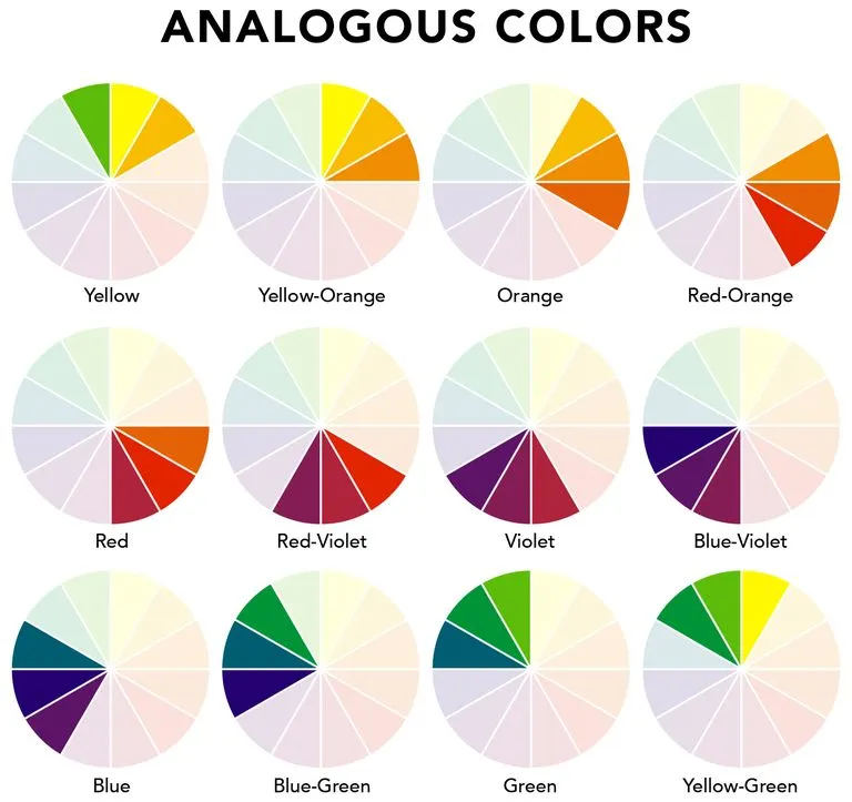
- In this colour scheme, colours situated next to or near each other on the prang colour chart are used. They are usually most agreeable when they are limited to those colours between the primary, for example, green, blue green; yellow, yellow green; green, yellow green; blue green, blue etc., The colours should always be in different values or different intensities.
- Analogous colour scheme is much more interesting than a monochromatic colour scheme. It is also a simple and easy colour scheme to choose and adopt even for an inexperienced interior decorator.

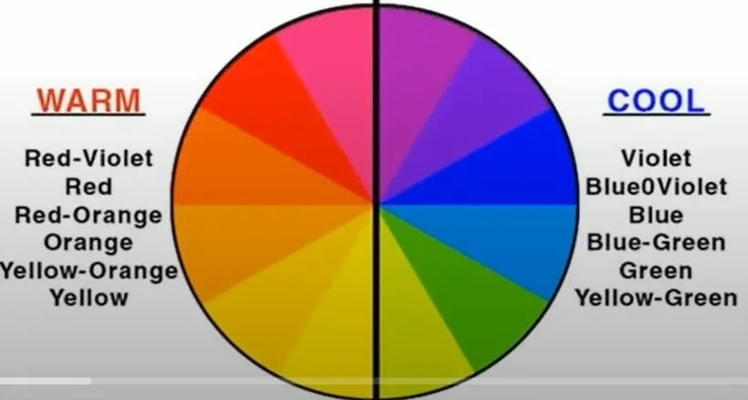
- All that is required is to choose the colours lying adjacent to each other in a colour wheel. While choosing the adjoining colours, one can choose either all warm or all cool colours, if it is desired so.
- For example, a combination of yellow, yellow orange, orange and red orange makes up a warm adjacent colour scheme. A combination of blue purple, blue, blue green and green provides a cool adjacent colour scheme.
- Though being harmonious, the analogous colour scheme provides variety in hues with subsequent coolness and warmthness of hues which makes it quiet different from monochromatic colour scheme.
- The shared hue in the analogous colour scheme with the predominance of cool and warm hues also makes the combination unified as compared to the combination of cool and warm hues in contrasting colour scheme.
- Thus this colour scheme provides a wide variety of choices to an interior decorator. Analogous harmonies are quiet and restful and show more variety than one hue harmonies but still more suitable for the entire room unless change is provided by texture.
2) Contrasting colour harmonies
- Difference in colours is the basis of the contrasting colour schemes. Two colours which are extremely opposite in which one might be cool and the other warm, are chosen for the colour schemes. The colours give great variations from highly saturated values to very dull combinations. If two contrasting colours are placed side-by-side, one appears to advance while the other seems to recede, producing a vibrant effect.
- Contrasting colour harmonies are of six types.

- Complementary harmony
- Double complementary harmony
- Split complementary harmony
- Triad harmony
- Tetrad harmony
- Achromatic/Accented Neutral harmony
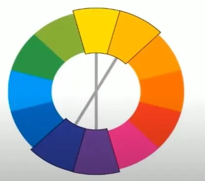
i) Complementary harmony
When colours directly opposite to each other in the colour wheel are used they form complementary harmony, few complementary colours are,
- Yellow and purple
- Red and green
- Orange and Blue
- Yellow orange and Blue purple
- Red orange and Blue green
- Red purple and yellow green

- These colours need not be used in their pure form, they can be used in many values or intensities.It is the most pleasing or least satisfactory colour harmony depending on how they are used.
- The effect produced by using this colour scheme is much livelier than any of the other related colour schemes. A complementary colour scheme is a stimulating, vivid and bright colour scheme. It provides a combination of both a warm and a cool colour, thereby results in a balanced combination. Between the two colours, one can be subdued and the other, dominating. Normally a cool colour is used in larger quantity or in larger areas as compared to the warmer one, to have a balanced effect.
- This colour scheme is highly suitable to such areas like living, nursery, teenagers and children’s and drawing rooms. Therefore, care should be taken to combine complements where either one of it should be of lower intensity and other can be of bright colour or else both the colours should be grayed. Similarly the scheme will also look pleasing if the complement chosen varies in their values too. Complementary colour schemes may be the most pleasing, or they may be the least satisfactory, depending upon how they are used.
ii) Double complementary colour harmony
This results when two directly adjacent colours and their complements are used together. Examples are,
- Yellow and yellow orange with purple and blue purple
- Yellow orange and orange with blue and blue purple
- Purple and red purple with yellow and yellow green
- Red and red orange with green and blue green
- In this there should be one outstanding hue for larger areas and it is dullest of all. The next may be little brighter but still dull, the third colour used in only a small amount must be half neutralized and the fourth one for the smallest accents may be in or near its brightest intensity.
- This colour scheme is exciting, lively and sophisticated. Besides, it also provides more variety than a simple complementary colour scheme. Since this colour scheme provides a combination of both warm and cool colours, they can be successfully used in any room size, whether big or small. They are ideal for use in common rooms like living or a lounge. When sufficient care is applied in the amounts of various colour used, they make a stimulating and lively atmosphere.
iii) Split complementary colour harmony
This harmony involves the use of three colours, combinations of a primary or an intermediate colour with the colours on either side of its complement form split complementary harmonies. Examples are,
- Yellow with red purple and blue purple
- Yellow orange with blue and purple
- Green with red purple and red orange.
- Blue green with red and orangel.

- As the term implies, one splits or divides the complement of one colour into its component parts and omits the complement itself. Thus the yellow, red purple and blue purple combination is secured by splitting the complement of yellow, which is purple into red purple and blue purple. These are the colours on either side of purple which, when mixed form purple.
- The combination of these three colours should also be used with the guiding principle of “Law of Colour Areas” to obtain pleasing and successful results. The combination of hues in this colour scheme results in less harsh contrast as compared to complementary colour scheme. It is always advisable to select combinations of a primary or an intermediate colour with the colours on the either side of its complement, rather than opting combinations with binary hues because its complement will be the primary hue and it is not possible to split primary hue as it constitute only one colour. Thus, care must be taken to initiate combinations of this colour scheme with either primary or intermediate hues.
- It is a harmony of similar colours with a note of contrasting colours and make a brilliant combination. It is also a lively and stimulating colour scheme. However, the warm hues in combination with the cool hues need careful handling because of their strong and advancing effects. When executed properly, this colour harmony would produce a pleasing effect.
iv) Triad harmony

- As the name suggest, the scheme consists of three colours. The hues situated equidistant from each other on the colour wheel forms a triad colour scheme. Since the contrast created by combining the hues in triad colour scheme is quite vigorous, it is always advisable to use triad hues in its neutralized form. Pure colours of triad combinations should never be used. “Law of Colour Areas” should be rigidly followed for the successful application of triad colour scheme. The combinations of hues in triad colour scheme requires a much tactful skill and knack of visualization as compared to other colour schemes.
- On the prang colour chart, equilateral triangles create four triads. These are: Primary triad, made of the three primary colours, red blue and yellow, the secondary or binary triad-green, orange and purple and the two intermediate triads-yellow orange, blue green and red purple; yellow green, blue purple and red orange. While triads are the richest of all the harmonies if they are well used, they are the ones, which need the most careful treatment.
v) Tetrad harmony

- This is a scheme which combines four colours situated equidistant from each other on the colour wheel.
- In all, there would be three tetrad combinations on the colour wheel such as YO, G, R and BV, RO, Y, BG and V, and O, YG, RV and B.
- The first set of tetrad combination will give a much pleasing and interesting effect in interiors as compared to the other two, the reason being the varied contrasting hues in it.
vi) Achromatic/Accented Neutral Colour harmony

- This is a scheme where only value variations of neutral colours are combined along with a contrasting, strong or a vivid hue in accents to uplift the scheme from monotony. This could be a scheme with one or more than one neutral hue combined harmoniously along with a strong contrasting hue. The neutral hues used in this scheme could be black, grey, white and brown. The contrasting hues could be shocking pink, green or yellow.
- The neutral scheme became popular because of its adaptability to both traditional and contemporary style.A neutral scheme allows for easy colour accents changed by the simple process of altering colour effects on small objects. Black-and-white schemes are highly dramatic because of their strong contrast. For example, a scheme could be developed with more than two-thirds of the area with white and less than one-third with black. Some grey could be introduced in a pattern. Whatever may be the combination, such a colour scheme should always be used with caution and in limited areas.
3) Colour schemes suitable for the residential interiors
- Generally the whole house is equally important while deciding the colour scheme.
- Each area in a house even if given different colour treatment, should have something common to bring harmony in the colour scheme of the complete house.
- This can be very well achieved when colours of the same family are selected.
- The transition in colours from one part of the house to another should always be given careful thought for unity and continuity in the use of colours.
- Avoid using too much of contrasting colours while connecting one area of the house to another.

4) Colour scheme for different rooms
The selection of colour scheme for different rooms should be primarily based on the following
- The functionality of the room
- The duration for which it is going to be used
- The time of day when it is going to be occupied
- Considering these, the final decision for a colour choice in different rooms should be made. Let us see in detail the individual colour choices for different rooms in the house.
i) Entrance Hall
- The colour scheme used in entrance hall should be same as living room.
- It should be a bit impersonal and dignified rather than reflecting the strong likes and dislikes of a person.
- Very little furniture is used in hall, so the interest could be provided by the use of colourful treatment to walls and floors.
ii) Living Room
- The living room is a place where family relaxes in the evening and where they entertain their guests.
- The choice of colour scheme should thus cater to both these needs.
- The cooler colours give restful and relaxed look to it and a touch of warm colour to make them look cheerful and hospitable.
- The light warm colours are used for tropical climate.
- For a temperate climate one could use white, brown, coral, neutralized lemon yellow.
- The living room colour scheme should provide a suitable lighter background for the objects placed against it like furniture, furnishings, decorative and functional accessories.
- In general the choice of colour for the living room should be of general interest of the family members, harmonizing well with the other colours on the floor, wall and ceiling.
- Light, warm and gay colours are the wise choice for extending hospitality, cheerfulness and welcoming feeling for the guests.
iii) Dining room
- It is a place where all the family members collect together to have meals.
- The number of gathering is totally dependent on the meal pattern of the family.
- But it is sure, that the total time spent in this area is comparatively quite less than relaxation or entertainment area. Thus, any colourful scheme could be the part of this area.
- Colours like lettuce green, shrimp pink, butter yellow, lemon yellow, watermelon rose, tomato red are some of the suggested colours which stimulates the appetite and at the same time gives a refreshing effect.
- Though such colours are quite striking but can be appropriate only if dining area is to be used only for dining purpose.
- In small flats where dining rooms are being utilized for various other activities too, instead, the gay colours matching with the living room should be selected.
iv) Kitchen
- It is the most crucial place of work which demands most of the homemaker’s time. Since this is a place where a lot of heat is generated during cooking processes, cool colours are more appropriate for it.
- At the same time in order to create a stimulating environment necessary for the productivity and creativity of the user, brighter colours in pots, dishes, kitchen accessories should be chosen.
- The background colours of the kitchen should always be lighter or white in colour for better light reflection resulting in better visibility.
- The colour of the cabinets, furniture and furnishings in the kitchen should match with the overall colour scheme of the kitchen.
- However, the orientation of the kitchen, the amount of natural light and size of the kitchen also determines its colour choice.
v) Bedrooms
- It is a place for relaxation which provides tranquility.
- Thus, the colours chosen should be cool and relaxing ones like blues, greens, off-white, etc.
- Simultaneously, the choice of colour in a bedroom is also solely dependent on the personal likings of the user as it is more often used personally by the occupant.
- While deciding about the bedroom colour scheme, the other factors like the availability of natural light, the exposure, size and shape of the room should also be considered.
- The sex and age of the occupant in a bedroom also influences the choice of bedroom colour scheme.
- A girl’s or woman’s bed room should have feminine colours such as pinks, yellows, lightly brighter, gay lighter hues; whereas the dark and neutral colours would be more appropriate for man’s or boys bedroom.
- Moderately loud, gay and cheerful colours by way of warm colours should always dominate the children’s room as they assist in personality and cognitive development of the children.
- A master’s bedroom should have colour choices of both of them. Guest rooms should have colours of general choice, rather impersonal as it can be used by either sex.
vi) Bathrooms
- Avoid using much neutralized colours in bathrooms as they are usually smaller in size and are being utilized for shorter periods.
- The more refreshing colours associated with nature like blue’s and green’s are the better choice for it.
- Off-white’s, grey’s and violet’s too look good in it.
- The colour of the bathroom wall, ceiling and floor should match with each other.
- One bright colour in smallest proportions matching the overall colour scheme, in the bathroom should dominate in bathroom linens. Bright colour breaks the monotony of the bathroom colour scheme and adds interesting effect to it.
- Silver, golden or any other coloured bathroom fixtures matching the colour scheme too prove to be aesthetically appealing. Usually white and light colours are the choice for bathroom colours from hygienic point of view too.
5) Conclusion
- To conclude the proper use and selection of colour scheme in interiors can add to the beauty of it or it could mar the overall effect of it. Thus, it is extremely essential and useful to know the various types of colour schemes, the combinations of the colours, in their different values and intensities.
- Colour harmony exists wherever colour or combined in a manner pleasing to the eye and to the senses.
- Colour harmonizing comes naturally to some and only after struggle and efforts for others.
- It has been said that there is no such things as a ugly colour, only colours that are used in correctly.
- Hence, this lesson may help you to identify the right colours suitable for various rooms.