
If you want to know about the scale in architecture or form in architecture or proportion in architecture, please click the link.
In architectural drawings, lettering is used to label, annotate, and provide information about the building or structure being designed. This includes labeling building elements, dimensions, materials, annotations, and other details.
The lettering used in architectural drawings should be legible, consistent in style, and conform to industry standards. The choice of font and size can also help to convey the intended hierarchy of information and clarify the designer’s intent. Proper use of lettering in architectural drawings is important for effective communication and to ensure accuracy in the final design.
1) Lettering
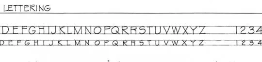
Writing of titles, dimensions, notes and other important particulars on a drawing is called lettering.
Lettering is an important part of a drawing. It should be clear, legible and uniform in its style. It should be in plain and simple style so that it could be done free hand and speedily.
The size and placement of lettering can also have a significant impact on its overall effect.
- Lettering is generally done in capital letters.
- Different sizes of letters are used for different purpose.
- The main titles are generally written in 6mm to 8mm sizes.
- Subtitles are written in 3mm to 5mm sizes.
- The drawing number in the title box is written in numerical of 10mm to 12mm size.
- The width of majority of letters is equal to the height.
- All letters should be uniform in shape, slope, size and shading.
- H or HB grade of pencil is recommended for lettering.
2) Types of Lettering using in the drawing
In architectural drawings, the following types of lettering are commonly used:
- Architectural lettering: a clear, legible font used for labeling plans, elevations, and sections.
- Dimension lettering: used for labeling measurements and annotations on drawings.
- Title lettering: used for creating headings and titles on drawings, often in a larger size than other text.
- Callout lettering: used to highlight specific features or details in a drawing, often with an arrow pointing to the specific location.
- Legend lettering: used to label symbols, abbreviations, and key information on drawings.
- Annotation lettering: used for providing additional information, notes, and explanations on drawings.
These types of lettering help to effectively communicate information, clarify design intent, and ensure accuracy in architectural drawings.
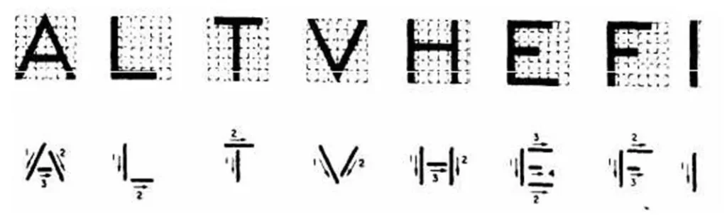
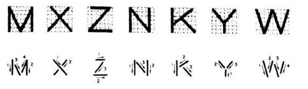
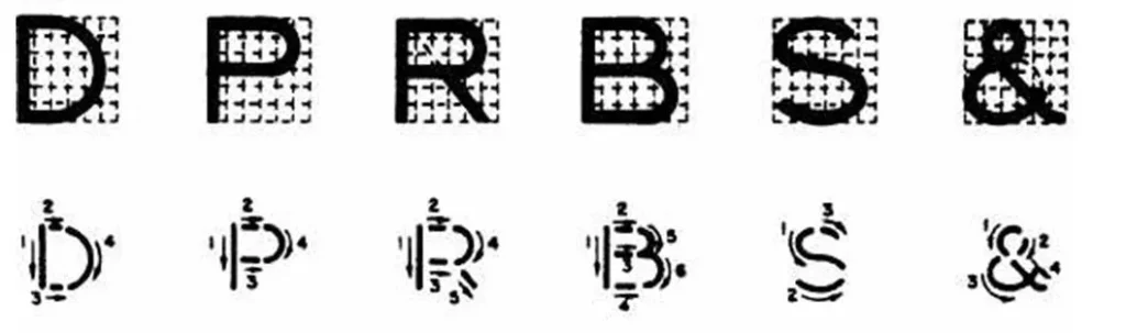
3) Lettering – Straight line letters
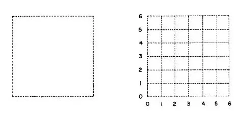
- Vertical capital letters are preferred for most technical work. They are formed within a 6 by 6 grid.
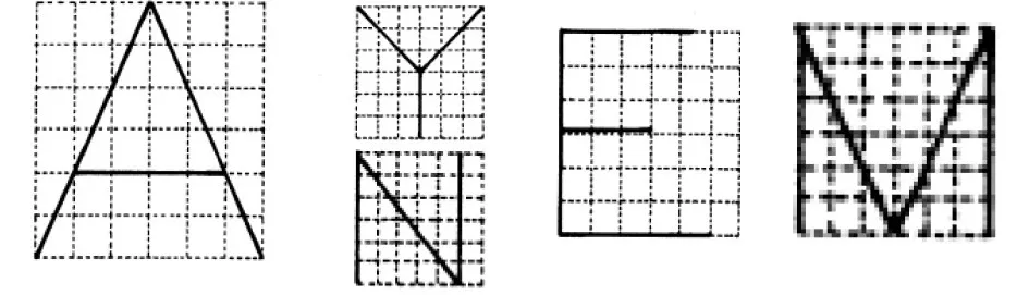
- This sequence is recommended to assure that each letter is the correct width in relation in height. For example, form the two vertical sides of the “H”, “N” and “M” first. Form the top of the “T” first.
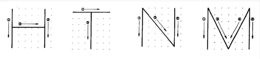
- The “H” and “N” are slightly narrower than they are tall. The “T” and the “M” are just as wide as they are tall
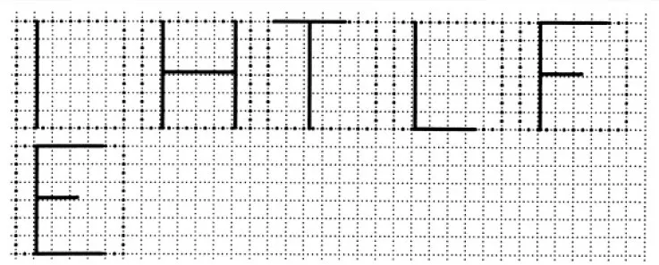
Note: Proportion: width vs. height is very important in forming letters.
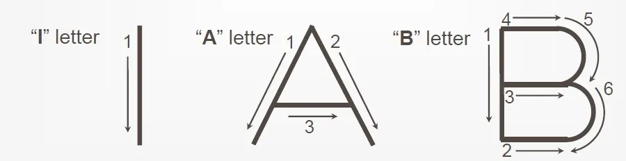
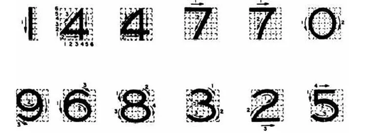
4) Basic strokes
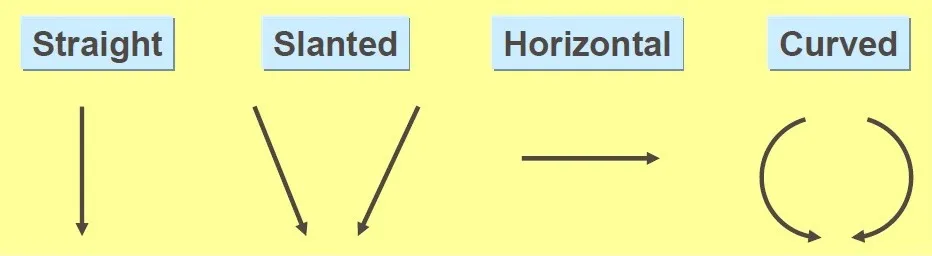
Examples: Application of basic stroke
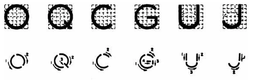
5) Upper – case letters & numerals
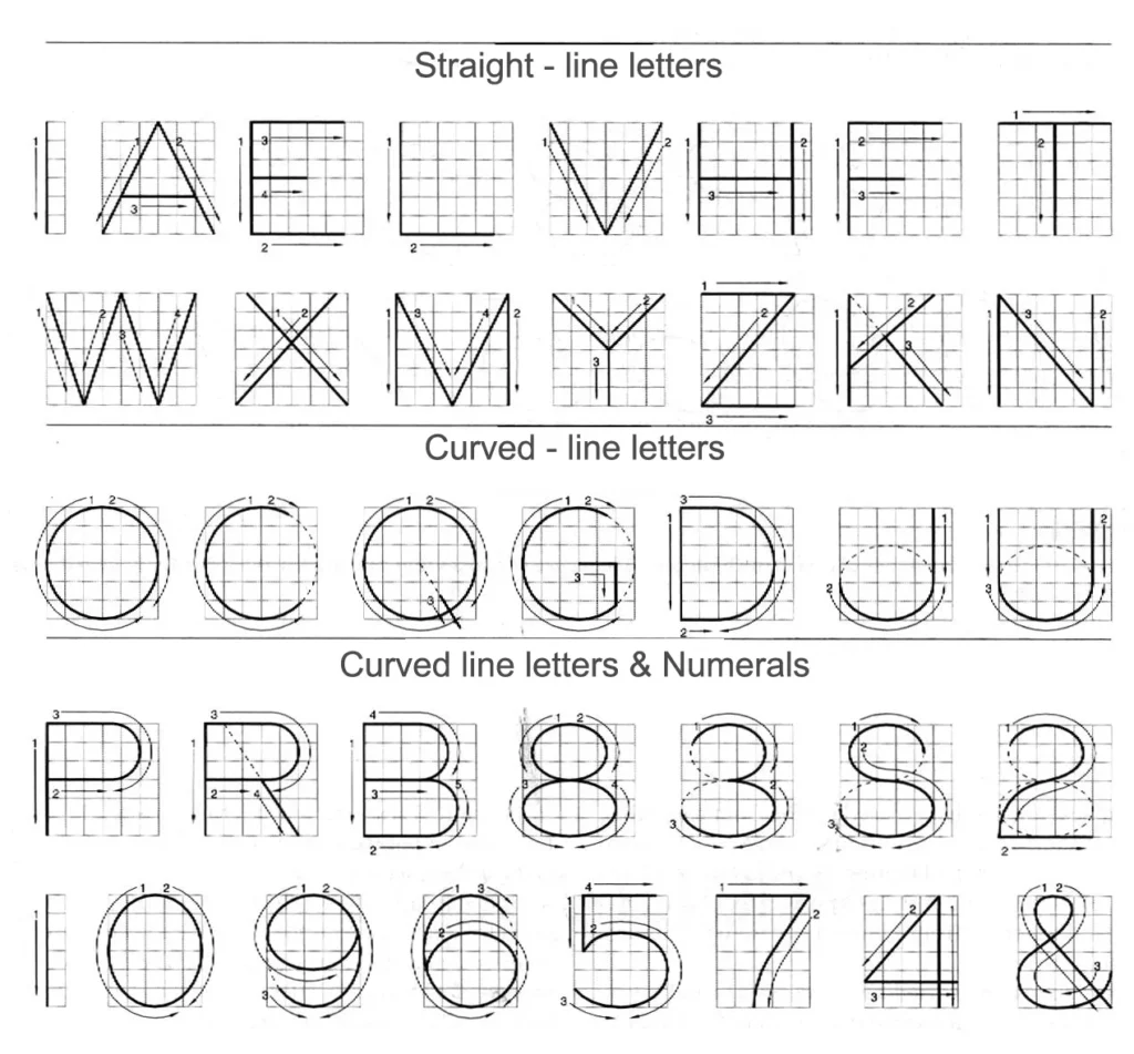
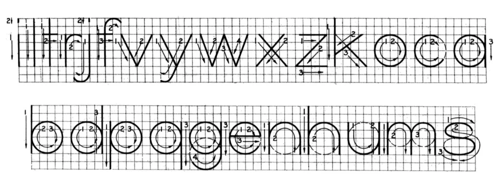
6) Lower – case letters
- The text’ s body height is about 2/3 the height of a capital letter.
7) Lettering – vertical gothic font
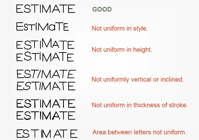
8) Example: Good and poor lettering
9) The recommended size of lettering in under
| ITEM | SIZE h, mm | |
| 1. | Drawing number in Title Block and letters denoting Cutting Plane Section | 10, 12 |
| 2. | Title of Drawing | 6, 8 |
| 4. | Sub-titles and Headings | 3, 4, 5, 6, |
| 5. | Notes, such as Legends, Schedules, Material list, Dimensioning | 3, 4, 5 |
| 6. | Alteration, Entries and Tolerances | 2, 3 |
10) Examples of lettering errors

11) Sentence composition
- Leave the space between words equal to the space requires for writing a letter “O”.
Example

When using lettering in architectural drawings, it’s important to maintain consistency in terms of font, style, and size, to help with legibility and to convey a professional image.
This is a life saver 🥰. Thank you