If you want to know about the elements of design or principles of design or lettering in architecture, please click the link.
In architectural design, line is a fundamental element used to define the form and structure of a building. It helps to create visual relationships between different elements and define the boundaries of spaces. The use of line can range from simple, straightforward lines to more complex, abstract designs.
- A dot extended becomes a line. When points are so close to one another that they can not be individually recognized the sensation of direction is increased and the chain of dots become a distinctive Line.
- A line is a collection of points made with a pen or brush It denotes a connection between any two points in space.
- Line is one of the most basic element of art and design

1) Types of lines
2) What do lines do
- They enhance comprehension and readability
- Can be a border or divider
- Can be a border or divider around elements
- Lines can provide an anchor to hold movements on a page
3) Properties of line
Dots create Line and line is the foundation of all drawings. Line in an art work can be used in many different ways. It can suggest shape, pattern, form, structure, growth, depth, distance, rhythm, movement and a range of emotions.
- A line is one dimensional – no width, only length
- The length of a line is infinite and extends in both directions. A line that connects 2 points is a Line segment.
- The shortest distance between two points is a straight line.
i) Physical characteristics
| 1. | Short or Long | |
| 2. | Thin or Thick | |
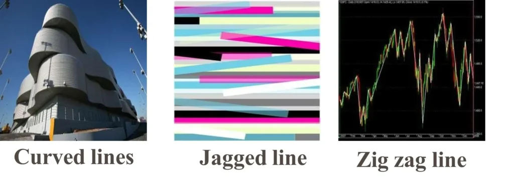
| 3. | Straight or Curved |   |
| 4. | Direct or Meandering |  |
| 5. | Zigzag or Serpentine |   |
| 6. | Distinct or Blurred |  |
- Position and shape bring in symbolism associated with lines:
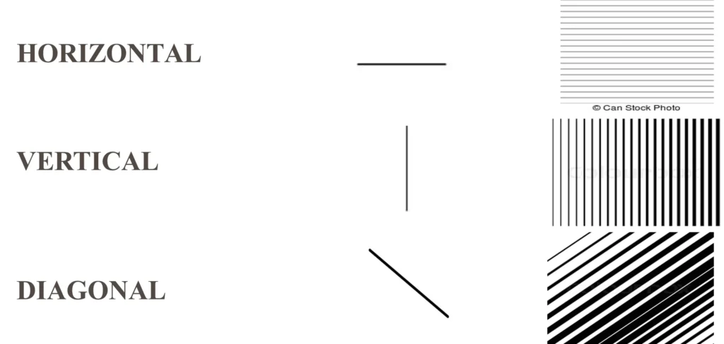
- Position wise, lines can be vertical, horizontal and diagonal. The following are generally considered:
- Vertical lines are ‘elevating’
- Horizontal lines are ‘reposing’ and
- Diagonal lines are ‘dynamic’.

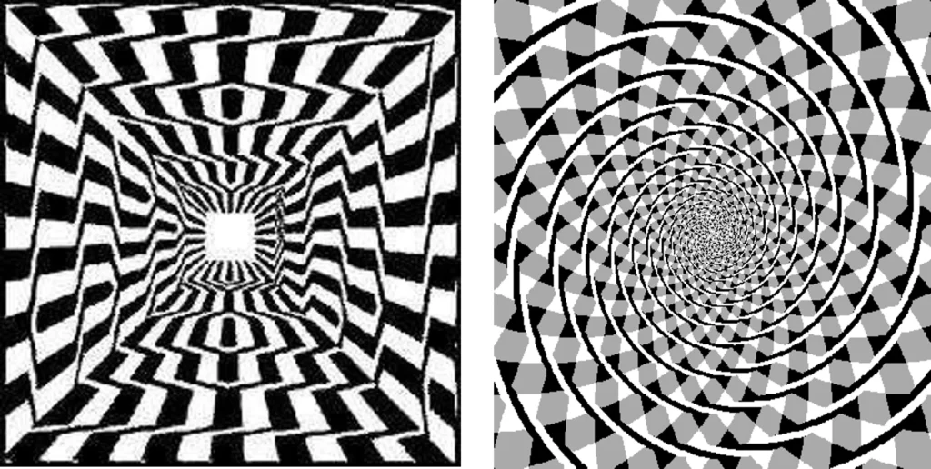
ii) Lines make optical illusions
- A straight line, in its continuity, ultimately seems stiff and rigid and, if rendered thinly, may appear even brittle.
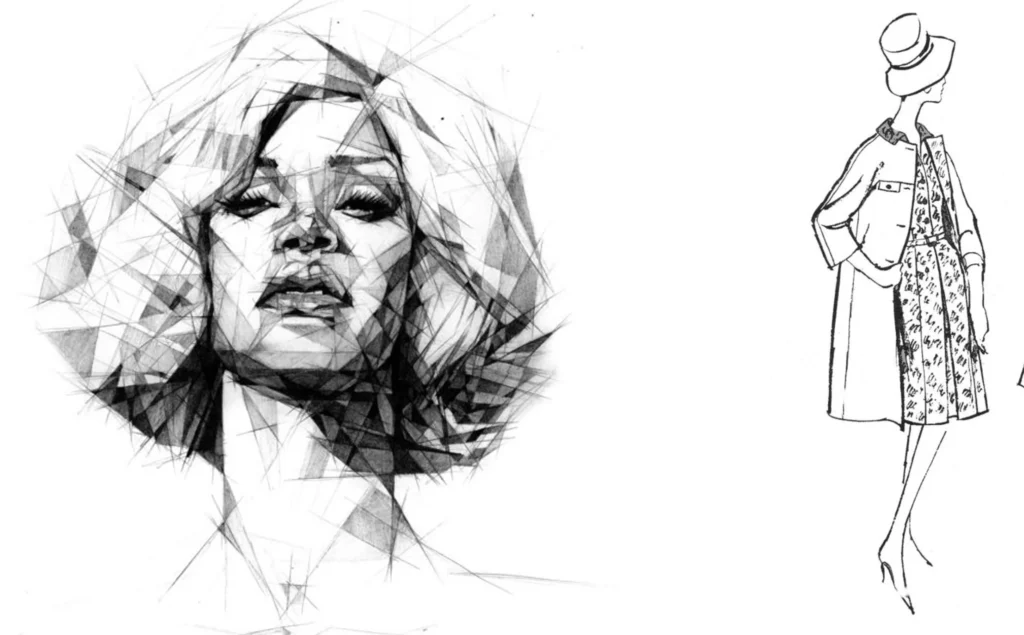
- A curved line is inherently graceful and, to a degree, unstable.

- Examples optical illusions
4) Construction lines
- Construction lines are temporary line work entities that can be used as references when creating and positioning other objects or line work.
- For example, you can use construction lines to prepare multiple views of the same item or create temporary intersections to serve as object snaps.

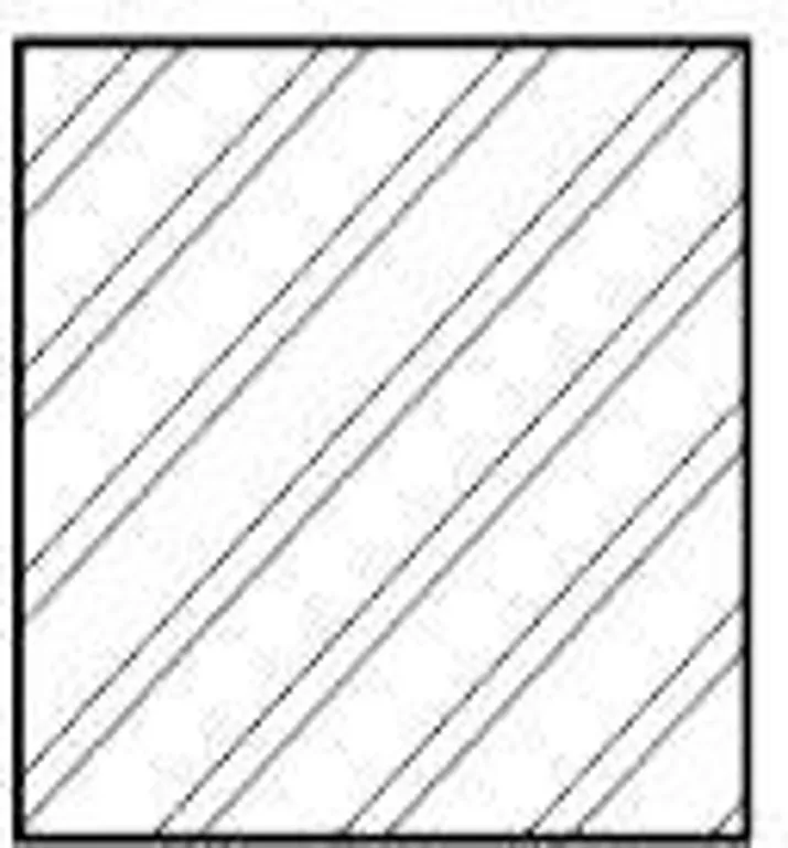
i) Section lines
- Section lines clarify the interior construction part of the object.
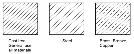
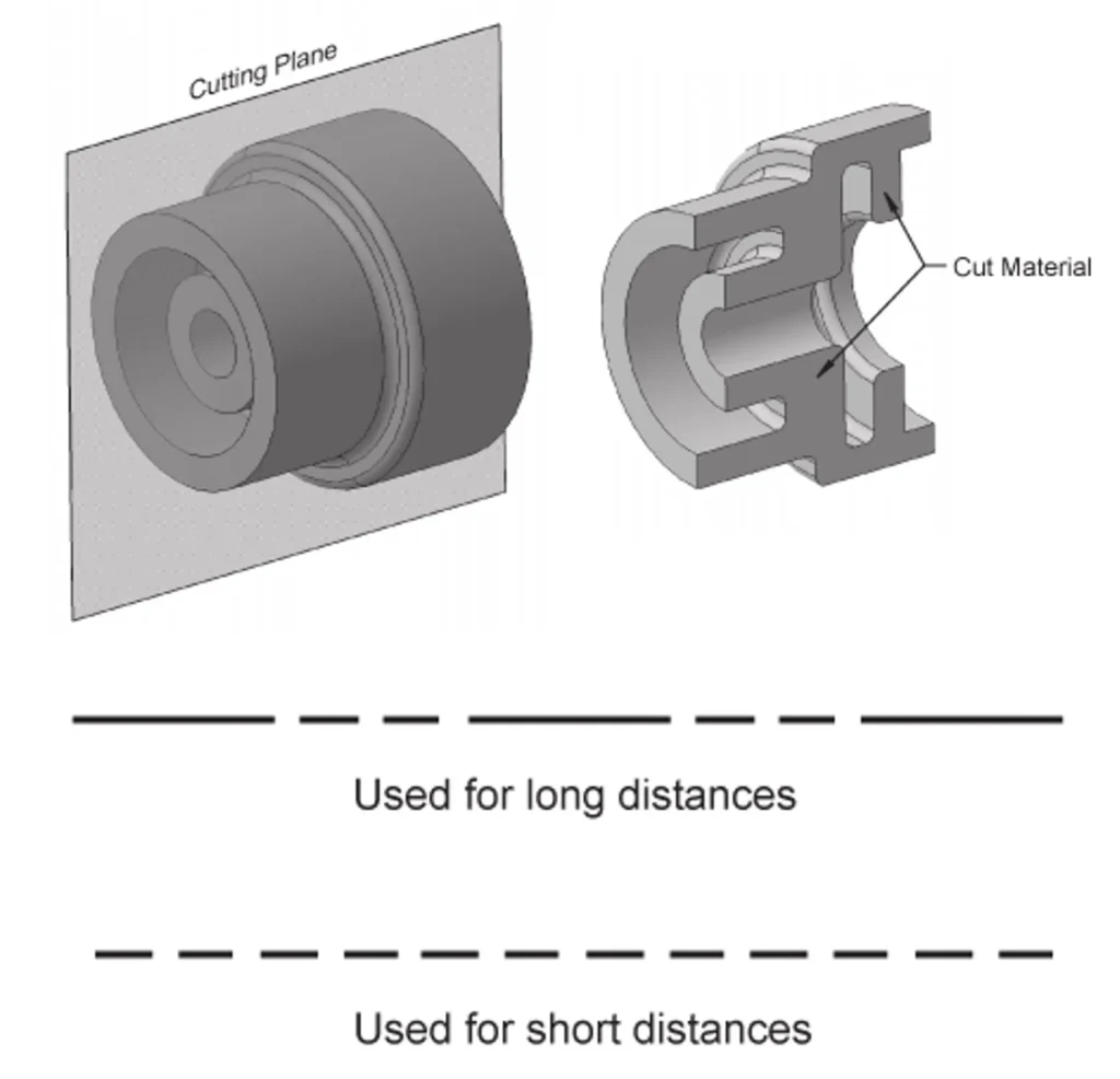
- Section lines or cross hatch lines are added to a section views to indicate a surface that are cut by a cutting plane.
- Section lines are different for each type of materials.
- Section lines are generally drawn at a 45° angle
ii) Hidden lines
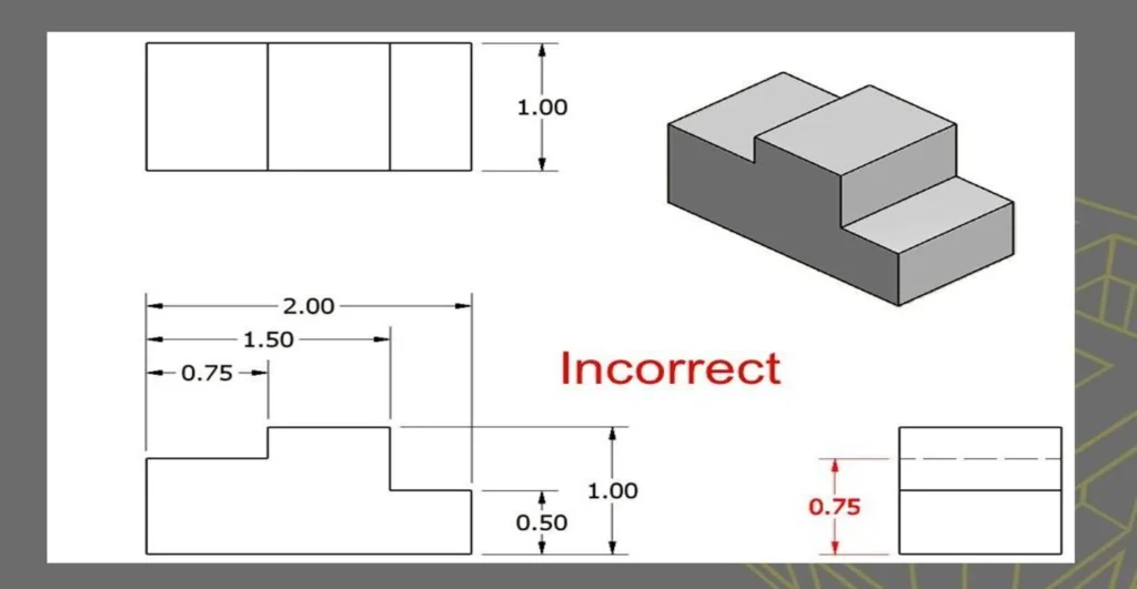
- It is standard practice to use dashes to represent any line of an object that is hidden from view.
- Hidden line should join the visible line, except it extended from the visible line.
- The hidden line is used to show features or edges of an object that is not visible.
- It is a broken line of medium thickness.

- Whenever possible, avoid dimensioning to hidden lines and featuring.
iii) Centre lines
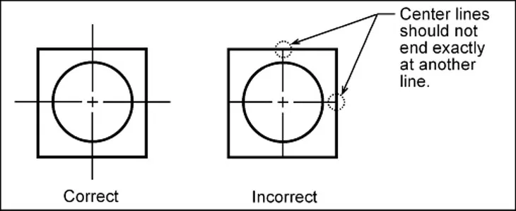
- A real or imaginary line through the center of something, especially one following an axis of symmetry.
- A center line is used to locate the center of the feature.
- It is usually a fine broken line made of alternating short and long dashes.
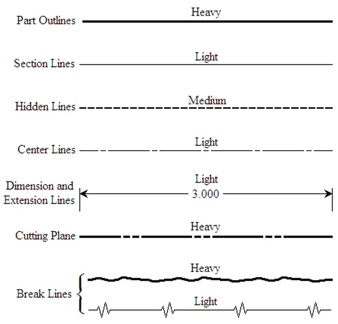
iv) Different types of Lines
Each line has a definite form & weight.
- Object line: lines which represent visible edges & surface boundary. Continuous, thick & wide lines.

- Dimension, extension & leader line: lines that indicates sizes & location of features

- Hidden lines: lines represent that cannot be seen in the view.

- Centre line: lines which are drawn to indicate the axis of any object to divide the object symmetrically.

- Break line: Break lines are used to show a break in a drawing when it is continuous and cannot be represented on paper.

- Hatching: lines drawn to make the section evident. Thin lines, 45° to the main outline, 1 or 2 mm apart. a series of simple and parallel lines to imply shade or tone changes.
5) Line Weight
- Line weight is the visual lightness, darkness, or heaviness of a line within a drawing.
- In any architectural drawing, from a sketch to a construction drawing, the interplay of different relative line weights is used to communicate depth, importance, and proximity.
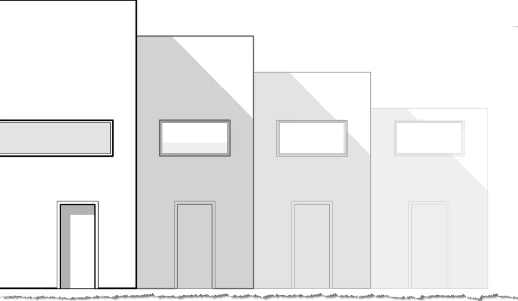
- A thickness applied to a line in order to give the line meaning.
- A range of line weights and thickness are used to show distance, elevation, and hierarchy, or even materials.
- When using line weights to represent distance or elevation, the closest line to you is the darkest, and the furthest away is assigned the lightest line weight. A range of line weights in-between helped to create a fading effect.
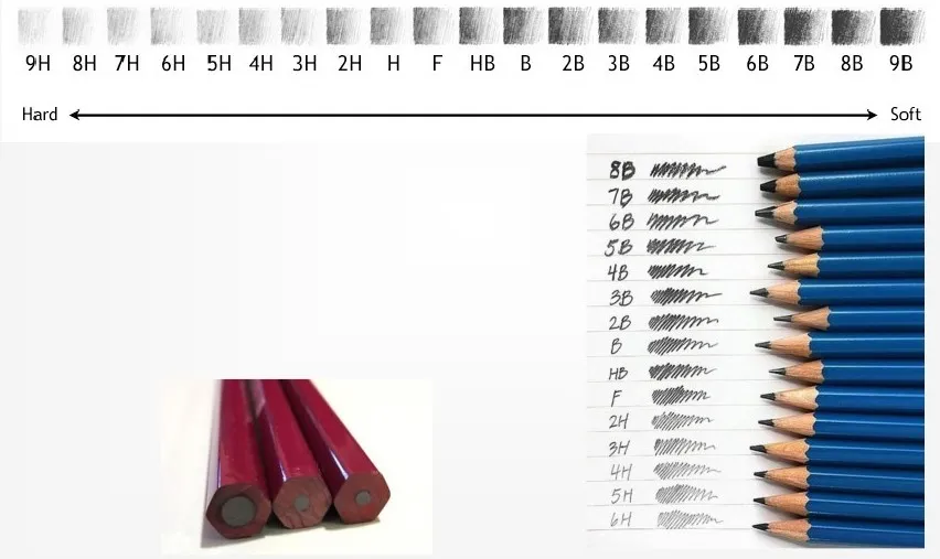
6) Pencil grades
Wooden pencils are graded and designated by numbers & letters.
- 9B,8B,7B…………..B in decreasing order of softness & bold.
- HB – medium grade
- H,2H,3H…………….9H in increasing order of hardness & light.
Overall, line plays a crucial role in architectural design and helps to create a building’s overall aesthetic and functionality.